Here is how to make your data clusters look pretty in no time (with python and matplotlib), with one-liner code hack.
I wanted to visualize in python and matplotlib the data clusters returned by clustering algorithms such as K-means (sklearn.cluster.KMeans) library. I initially manually dispatched the set into groups and attached colors to labels, like this:
fig, axes = plt.subplots(2,2, figsize=(20,10))
axes.scatter(group0[:,0], group0[:,1], c='green', s=10) axes.scatter(group1[:,0], group1[:,1], color='red', s=10)
axes.scatter(group2[:,0], group2[:,1], color='blue', s=10)
This gave two problems. First, I had to manually add colors whenever the number of clusters changed. Second, the drawing was simply not aesthetic, see below (or my previous post). It tells immediately that the author is an engineer, not an artist.
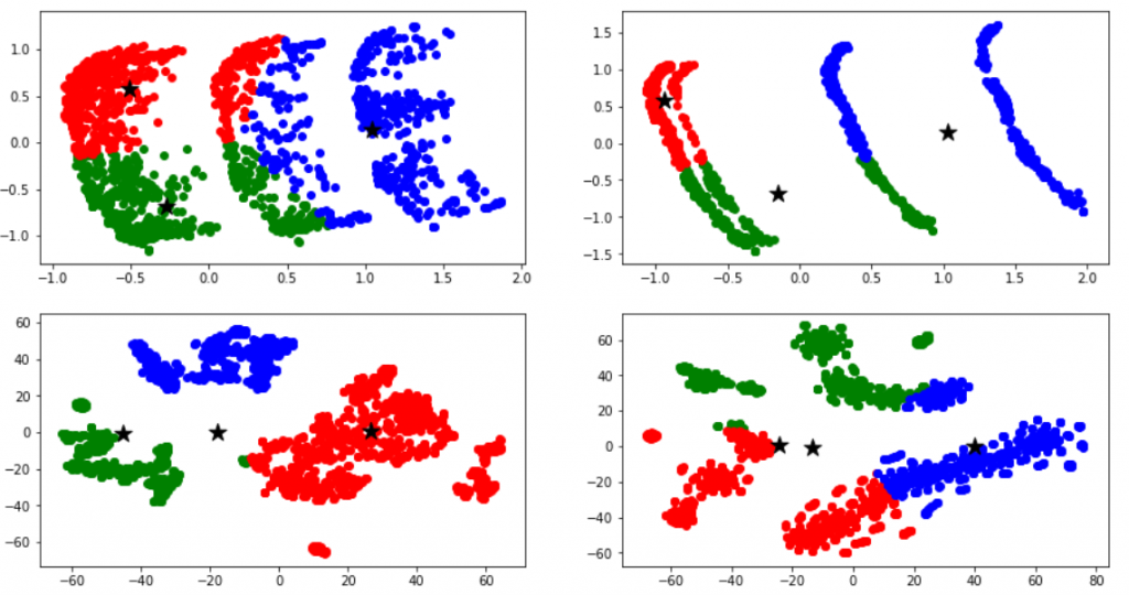
Selecting colors that are aesthetically pleasing is not what you want to spend your time on, when you have a data science analysis to do. Then how to draw a pretty K-means visualizations in no time? Use color maps, which are predefined sets of matching colors. The trick is to map your cluster labels directly to color maps, like this:
axes.scatter(data[:,0], data[:,1], c=labels, cmap = 'Accent', s=10)
Instead of color, we use two arguments: c and cmap. The latter argument is the color map name, from matplotlib color map reference . Note that this new code snippet is also technically superior:
- no need to manually divide data set into groups
- 1 line of code instead of 3
- coloring is automatically derived from the labels (derived from K-means)
Here is the result of clustering with color maps that give nice results.
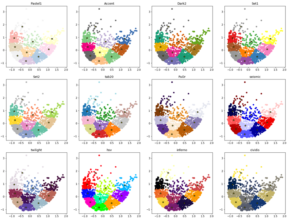
My basic observations for the best results to visualize distinct data clusters:
- avoid too light color maps. eg. Pastel1 color map is never good.
- avoid sequential color maps
- the type of optimal color map will differ depending on the point density, and point size (parameter s)
- the smaller number of clusters you have, the more contrasting color map you want to pick.
Here below are four color maps that I liked most in my recent visualization: Set2, twilight, PuOr and cividis. Scroll up to compare this to the original red/blue/green drawing, and you’ll find the difference.
