
Suppose all you had was a history of user requests to the service desk. Would you be able to determine how many of those requests were honest?
This piece is a loose follow-up to the last-week article The phantom I followed, where I showed some caveats of data visualization. Here, let’s continue the same work. The problem definition, again, is:
The Service Desk works on tickets, which represent incidents manually reported by users. A reporter arbitrarily assigns ticket priority: Minor (4), Major (3), Critical(2), or Blocker (1). For frustrated users, it may be tempting to ramp up the ticket priority. Perhaps … a minor issue could be marked major, for faster resolution? We’d like to know whether, and how often, this is happening. Such information can be vital to project management.
As input, we have the history of tickets, associated with priority and reporter. Nothing more.
A methodology blueprint
I will not attack the problem directly but from aside. Let’s define the user average as the average priority of all incidents that the user has submitted over his/her entire career. Now, suppose all users were fair in ranking their tickets (this is our null hypothesis). Then all the user averages should be similar. The expected distribution of user averages can be generated with Monte Carlo simulation, with samples drawn from the existing frequency distribution of all ticket priorities in our set. By the Central Limit Theorem, we should come up with normal distribution (below, right). Then we can compare it to the overall actual distribution (below, left).
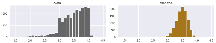
We immediately see that users are not fair in their ranking of tickets. Statistically, there are too many marginal users, who rank priorities consistently too high or too low. But a claim that users cheat would be premature. We observed that the user group is not consistent in their judgment, but who knows why? Maybe some users work in different business contexts, with a legitimate reason for ranking their incidents high.
We need to find whether the abnormal deviation from the expected result is caused by the human factor. Not easy. But how about comparing the behavior of junior users to senior ones? If there is a difference, it is probably caused by the human factor. For instance, inexperienced users may be more motivated but also stressed. Experienced users may be more mature in judgment, but also more cynical. All this can somehow influence their decisions. Differences in behavior between the junior and senior populations are more likely to be explained by the human factor than anything else.
The perils of data visualization
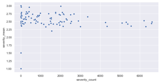
Moving on to the data set we are expected to analyze (let’s call it Project A), here is a chart showing all our users as dots, in a fashion familiar to the readers of my previous article. The user seniority (defined as the number of tickets the user has submitted over their lifetime) is on the x-axis. The user average is on the y-axis. Interestingly, there seems to be a slight correlation between x and y. Scatterplots have their limits though. Let’s work with the actual distributions.
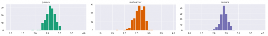
I grouped users into three sets: juniors, mid-careers, and seniors (based on the number of tickets they submitted over lifetime). Here is a distribution of user averages in each group.
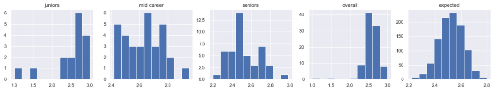
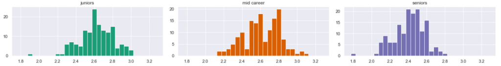
Bingo, we can already tell difference between juniors, mid-career, and seniors! … Nope. Way too early. Consider the x-axis scales. The charts have not been normalized. Python’s matplotlib and seaborn histograms are cumbersome in setting their bin parameter right. After some work, here is the same data, now normalized and prettier.
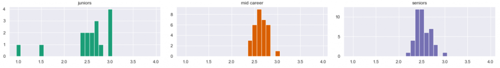
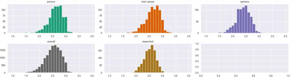
It’s the same data as before, but it looks different. But the charts are still wrong. After giving it some thought, I saw a methodic error. The entire concept of user averages was biased. If a senior user created 5,000 tickets over his/her lifetime, then only the most recent tickets should be taken into statistics for seniors. When this user has submitted his/her 20th tickets, he was still junior, and when he was submitting ticket number 500, he was mid-career. So I reorganized the sampling. This time, I sampled all three distributions from all users, taking into account the three different time periods of their careers. The additional advantage of this approach was the ability to oversample: suppose one data point is now an average from a sample of 50 tickets from a certain point of the user’s career. Then a user with a history of 5,000 tickets could provide 100 samples rather than 1. More samples is always better than less. Here are the resulting diagrams.
The correct visualization… still misleading
Now our visualization is correct. The distributions became more alike. I am leaning to the conclusion that there may be no statistical difference between them… or maybe there is? For instance, we seem to see a single mode (peak) in the senior population (rightmost, blue), while the orange mid-career population is seemingly bimodal (with two spikes). But that is not the case. Those are not data features, but deceiving, intrinsic features of the histograms. Let’s compare the diagrams above with those below:
They now look quite different: now the blue is bimodal, and the orange is trimodal. But it is the same data! By looking at the x-axis scale, you will see that I simply reorganized the histogram bins. I am showing the same data, but it now looks different. Unfortunately, this is how it works. Histograms change shape when magnified, therefore they must be taken with the grain of salt. All right then, is there a way to compare the three data sets? If one visualization shows the difference and the other shows no difference, then what to do? Two answers here.
- What we have been doing so far is the Exploratory Data Analysis. It should not be confused with statistical analysis. Now that we have gotten a grasp of how the data looks, it is time to proceed with the proper statistical tests. The normality test and test for goodness of fit (keywords here are Kolmogorov-Smirnov and chi-square) can tell us whether those populations are significantly different or not. I cover this in a subsequent article.
- However, for those who dislike numbers, there is a shortcut, a quick-win, allowing us to cheat and actually come up with reasonable tentative answers without statistics. Read on below.
A shortcut for quick conclusion
A shortcut I know is called the comparative analysis. You don’t need statistics, but you do need some experience. You do it in two steps. First step: radically oversample. This means to provide so many samples that random features of the histogram become invisible and irrelevant. What is left is the true nature of things, so to speak. This is not always possible. In our case, we are lucky because we can increase the volume of samples by lowering the sample size. Here is the result:
It is still hard to tell whether the samples are different. At this point it is reasonable to think that they are, in practice, not. But we have not finished yet. Second step: compare this to another, known project. Here below is my other project B, which I analyzed earlier. I know that project reasonably well. I know that the human factor played an important role in the rating of the incidents:
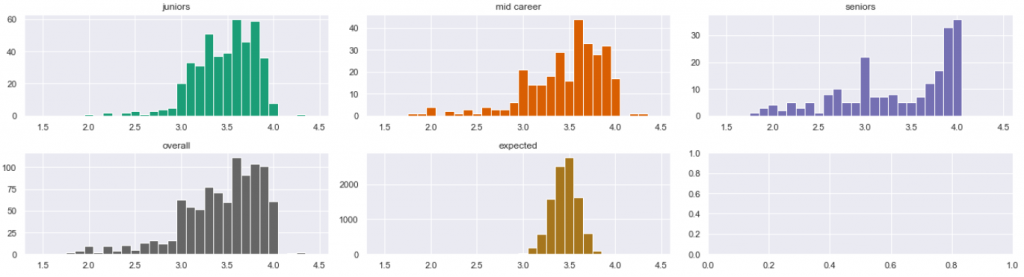
Now I hope the answer is clear. In project B, the difference between juniors (green) and seniors (blue) is striking. The former ones tend to ramp up their priorities, while the latter ones are more conservative in judgment. Equipped with this knowledge, looking back, we can tell that in project A, all groups behave the same.
Interestingly, our initial intuition was quite different.
Summary
For whatever reason (out of the scope of this article), in project A the management was successful in limiting the human factor to the minimum. Incidents have been ranked consistently, and the user seniority has no impact on how they rank incidents.
In Project B, the situation is different. The junior users tend to ramp up their priorities, while the seniors are more conservative in judgment. This is not necessarily caused by cheating. Lack of experience, poor education, stress, or other reasons may contribute. However, the human factor is the most likely an important part of the reason. By isolating the outliers, we can identify the particular users whose judgment was most flawed.
In the effect, in Project A, the ticket priority can be considered a trusted measure, useful as input for any further research. In Project B, it cannot be. There, it is an arbitrary number, subject to the personal judgment of individuals, or even their mood of the day.
So far so good, using comparative visual analysis. Proper statistical analysis should come next, and that is covered in the next article.
.
Credits
Credits for this work, of course, go to Sopra Steria which provided data for this research. This work is part of our constantly growing expertise in the AIOps domain (that’s Data Science applied to IT Service Management). For any Service Desk, Infrastructure Management, or Application Management project, consider Sopra Steria as your service provider. The Lagoon Data Lake which we internally operate provides an opportunity for comparative analyses. The resulting insight is aimed to optimize your project for performance and cost.