
Longormal data is very tricky. Wrong visualization methods can lead to radical misinterpretation of the result. In this article I show an example of such a mistake based on a real project, and I demonstrate how to avoid the caveats by proper visualization on a logarithmic scale.
What follows is a rendering of a Jupyter notebook. Users not interested in source code may simply skip over the Python sections, and focus on diagrams alone. The sources of the functions used are available in github.
The problem with lognormal data
When your data has lognormal properties, it needs to be drawn on a logarithmic scale. Let me explain what I mean by this, and present you with simple python utility that makes this easier.
First let’s generate a lognormal data set. This is how it looks in a simple histogram.
import sys
import pandas as pd, numpy as np
import matplotlib.pyplot as plt, seaborn as sns
sys.path.insert(0, '../modules') # change this to your local setup
import loghist
sns.set()
x = np.random.lognormal(mean=10.0, sigma=0.8, size = 100000)
fig, ax = plt.subplots(1,1, figsize = (20, 3))
ax.hist(x = x, bins = 100, range = (0, 200000))
ax.axvline(x=11000, color='red', linestyle='dashed', linewidth=2, label='mode')
ax.axvline(x=x.mean(), color='black', linestyle='dashed', linewidth=2, label='mean')
plt.show()

The histogram is right-skewed. The spike is towards the left of the diagram, and very long tail extends to the right.
In fact, many real-life data sets have this property. For instance, the data on people’s salaries is often longormal. As another example, I work a lot with help desk incidents data. When you consider the incident lifetime, is usually lognormal, because there are many incidents resolved very quickly, but also quite a lot of incidents resolved long. However, since these incidents that live longer have lifetimes very different from each other, they do not form another spike but instead they form the long tail.
And this defines the problem with visualizing the lognormal population. Question: what is the average value of the population visualized above? An unexperienced reader will indicate the value of 11,000 indicated by the red dashed line. In fact, the correct answer is 30,000 indicated by the black dash. Due to visual insignificance of the long tail that extends far to the right, the human readers tend to diminish its importance. This leads to failures in interpretation. This time we “only” misjudged three times. Below I will demonstrate a more radical example.
Now it gets interesting
Below I will generate a simple trimodal distribution (in simple terms, a set composed of three distinct sets of data).
df1 = pd.DataFrame({'data': np.random.lognormal(mean=3.0,
                                                sigma=1.3,
                                                size = 10000),
                    'category': 1})
df2 = pd.DataFrame({'data': np.random.lognormal(mean=8.0,
                                                sigma=1.2,
                                                size = 10000),
                    'category': 2})
df3 = pd.DataFrame({'data': np.random.lognormal(mean=13.0,
                                                sigma=1,
                                                size = 10000),
                    'category': 3})
df = pd.concat([df1, df2, df3])
Let’s assume for the moment that the data represents lengths of certain events, expressed in minutes. For instance, let each data point represent the lifetime of a single hardware failure (in other words, it tells us how many minutes that failure lasted). So we have the history of 30,000 hardware failures. What do they have in common? What is the most probable time of a network failure in this infrastructure? Let’s examine this data on the linear scale, with eight different time spans: from one minute, to one year:
loghist.hist8t(df, 'data', unit = 'minute') # this method assumes the data represents minutes

Again, what do you think is the mean value and how long, on average, an incident lasts?
It visually seems that the average is about 10 or 20 minutes…. So let’s check:
df.data.mean()
250390.02681005307
Surprise…in fact the average is about 250,000 minutes, that is 170 days. Our estimate was 100,000 times wrong. How could we be so wrong? What happened? The only thing that happened is the wrong visualization method. Let’s visualize the same data again using the logarithmic scale, below.
fig, ax = plt.subplots(1,1, figsize = (15,4))
ax.axvline(x=df.data.mean(), color='black', linestyle='dashed', linewidth=2, label='mean')
loghist.lhist(axis = ax, df = df, field = 'data')
plt.show()

This method gives us better insight into the shape of the set. First of all, the data looks completely different! We see the population is in fact trimodal (in other words, it consists of three distinct populations). In practical terms, it seems that there are three groups of hardware outages. The first group contain failures that take about 10 seconds. The failures in the second group take a few hours to solve. And the third group contains events that last several months. Now the average, represented as the black dash, makes perfect sense.
Due to the nature of lognormal data, the second and third groups were completely invisible in the linear scale diagram.
introducing the loghist module
This is why I created a very simple Python utility module loghist that helps visualize the data with lognormal distributions. Above you saw two utility methods that present the data using either linear or logarithmic x axis. In our particular case, the logarithmic histogram was more compact and more informative.
Even more interesting is the possibility of visual “stacking” of the data.
Let’s represent these three sub-populations as three colors on a stacked histogram. Both methods mentioned above can do this. Let us first see how this would look on linear scale, and then again on logarithmic scale.
linear scale
loghist.hist8t_stacked(df, 'data', group_field = 'category', unit = 'minute')

logarithmic scale
fig, ax = plt.subplots(1,1, figsize = (15,4))
loghist.lhist(axis = ax, df = df, field = 'data', group_field = 'category', bin_density = 8)

This time again, the data visualized in linear scale makes apparently no sense and looks like uninteresting garbage. The same data, on logarithmic scale, makes a lot of sense. We can clearly see how the three distinct populations partially overlap.
Long story short: if you suspect that your data set has lognormal properties, and a long right tail, try to use the logarithmic charts and chances are that they will reveal much more about your data set.
The utility module named loghist presented above is available in github (click here). Feel free to use it and improve it, and drop me a note if you do. The purpose of the module is illustrative rather than production. It leaves plenty of space for an improvement for the quality and robustness.
Addendum 2021-10-19
After publishing the article I had an interesting internal exchange in Sopra Steria Data Science circles.
My colleague Pierre-Henry Lambert indicated that the logic above is somewhat weak for two reasons. One, the average (mean) is a rather poor measure of a distribution. In most cases the median should be used instead (for robustness agains outliers etc.). Another argument, broader, is that it is wrong to assume that a population can be described by a single measure, no matter what it is. Thus, the question “what is the average of this population” may be a wrong question to ask. (Thanks for this, Pierre-Henry!)
I agreed with both points made. In this article I did not mean to discuss that the average was not where it seemed, but to merely use that fact as an example to show something broader: visualizing a lognormal data on a linear axis leads to all sorts of wrong conclusions. Misjudgment of the average is just one example. Another example is the fact that the population seems one-modal, while in fact it is trimodal.
Those considerations brought me to one more interesting “proof” why the logarithmic axis is correct. Instead of asking where is the average, let’s ask a related question: where is the median? And then let’s find the median on the logarithmic scale. Here is the result:
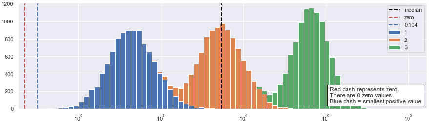
Interestingly, the median now beautifully appears exactly where an unexperienced reader would place it.
This operation demonstrates even better that in our particular case the logarithmic visualization “correct”, in a sense that it provides a representation that is very close to an intuitive understanding of an unexperienced reader.