
I am big fan of advanced methods deployed to solve practical problems by ordinary users. Here is our recent achievement.
My colleague, an experienced service desk manager, observed that the volume of work in his team has grown. He would like to know why. With a few mouse clicks, now he can. He will run the Chi-square statistical test for independence, without knowing it.
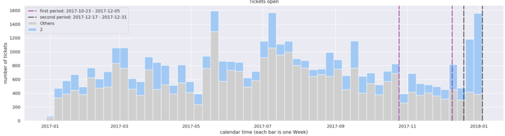
We tentatively called this the Quick Insight App. It implements the method described in this article: Answering Why (with Chi-Square) wrapped in such a way that it is usable by ordinary users with no statistical background. The app is currently available for Sopra Steria’s Lagoon Data Lake’s users. Here is how it works. After the launch, the app shows the histogram of the service desk tickets from the past year. The lower chart shows the weekly count.

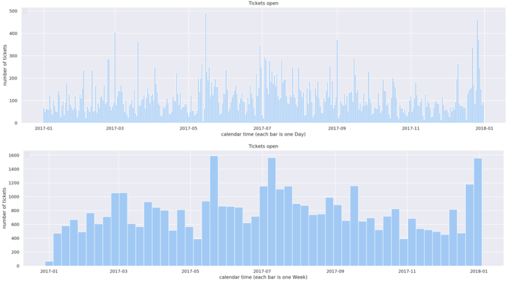
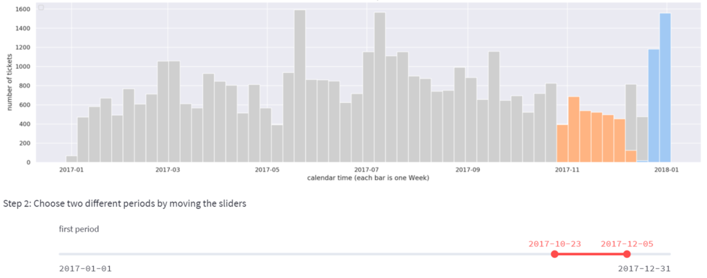
In the recent months we had about 500 – 600 tickets per week. However, in the last two weeks of December we had an alarming growth to 1200 and then 1600 tickets per week. We would like to understand why this happened. Using the slider, in the step 2 we will mark the two periods we want to compare: the “normal” period (orange) and the “strange” period (blue):
We want to understand what features of the data changed the most between those periods. This is the most difficult step, which, in the case of manual analysis, could easily take hours or days. The data has hundreds of features. Which feature we should look at? Maybe the growth is related to a certain category of tickets? Or a particular physical location of users? Or particular names of client employees who became more active? Or the time of day? The possibilities are plentiful.
So we have reduced this step 3 to one mouse click: the Analyse button. It will tell us why the volume has grown.
More precisely, it will run the Chi-square test for independence in order to establish which features (fields) of the data show the most substantial difference in frequencies between the two periods. The result:
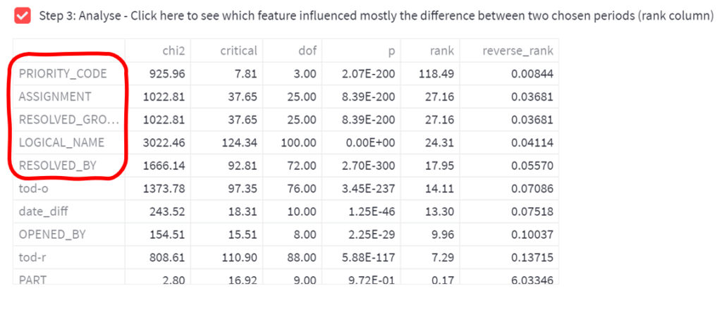
The features ranked high (marked red) are the “top suspects”, that show the most striking differences between the two periods. In our case, the secret of the growth is related to things like Priority Code, Assignment, and Logical Name. That’s all an unexperienced user needs to know.
An experienced user can also examine the remaining numbers, to understand better why the Chi-square test has identified these particular features as the most interesting: the Chi2 statistics of these variables is high, and p-value is low. One can also examine the parameters specific to the Chi-square distribution: the critical values and the Chi-square degrees of freedom. All these numbers impact the rank column, which defines the final sorting order. The non-experienced user does not need to worry about these things.
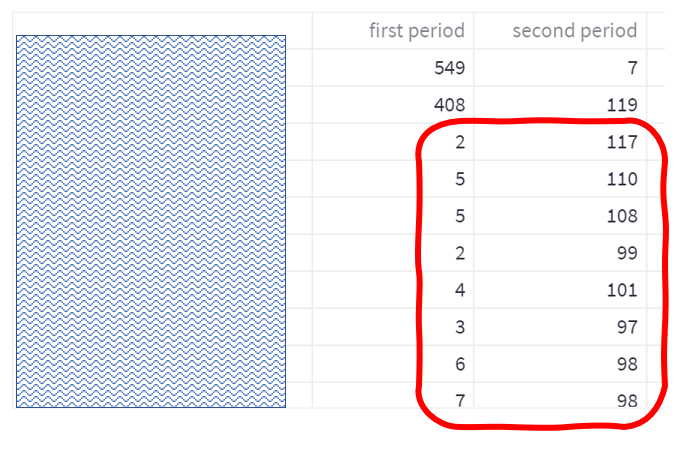
Now that we established that the feature Priority is most interesting, we are just one step from the insight that we need. In step 4 let’s display the frequencies of the Priority values in both periods:
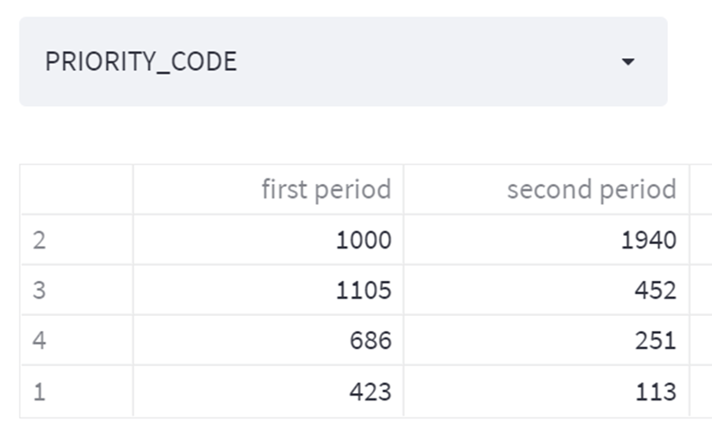
We immediately see that is the Priority 2 that is interesting. The second period has too many Priority 2 tickets. In the final step 5 we can visualize this: we will color these P2 tickets blue, to see how would the remaining (grey) chart look if they weren’t there.
The interpretation: Bingo. Our guess (backed by Chi-square hints) was correct: the Priority 2 tickets are responsible for the spike. That’s already something, but we can dig deeper. Let’s go back to the step 4 and examine another feature from the list of suspects: the Logical Name (the name of the server associated with the ticket). The output, containing frequencies of Logical Names in the two periods is below. (Note 1: the names of the servers have been hidden for confidentiality, but we can still see the numbers of tickets per server. Note 2: the output is long, so only the interesting part has been shown)
The interpretation: again, we immediately see something interesting. The growth of the volume is clearly linked to a handful of machines, which have been quite idle in the first period, but started throwing 100 tickets each in the second period. Let’s visualise (color) eight of those machines:

Again, bingo. Those are the machines that are responsible for the highest spikes.
So this way we have quickly established that the spike consists of Priority 2 tickets coming from particular machines. We can continue digging, to quickly establish more information to help us understand what has been happening, and what factors influenced the shape of the histogram that appears bizarre.
Summary
Thus an important user problem has been solved with niche statistical method. The interface has been done in such a way that the user does not need to comprehend the nature of the statistical test used, or even know that such a test has been executed. This becomes clear when this article gets compared to the earlier article, where the same method is explained to data scientists using a Jupyter notebook print out.
Credits: creating this material was possible thanks to my Data Science work for Sopra Steria. Contact us if interested in using our solutions. Also, we always look for talent. Here are the contact forms. Special credits go to my team who participated in the development of the Quick Insights App, alphabetically: Wiktor Flis, Katarzyna Kopeć, Konrad Skrzekowski, and Mateusz Szybiak. Thx & well done!