
I often feel the gap between the mainstream Data Science rhetoric and the true business needs is widening. When I hear of Hyperautomation, Edge AI, AutoML, or GANs, I challenge myself to take a leap back, understand our needs better. Here is a beautiful example how we just solved a tough business problem with good old linear regression.
For those unfamiliar, the linear regression is the simplest possible prediction model explaining the relationship between variables x and y as a simple proportion. It requires a pen and paper. Developed by Legendre (1805) and Gauss (1809), it precedes the Machine Learning by two centuries.
The objective
Here is the problem. As the Service Desk manager, I am looking at the last year’s volume of tickets we received, divided by weeks:

Have there been any trends? Hard to tell. The quantities fluctuate up and down. However, there may be trends hidden inside the data, visible after revealing some subcategories. For instance, let’s group these tickets by priority:
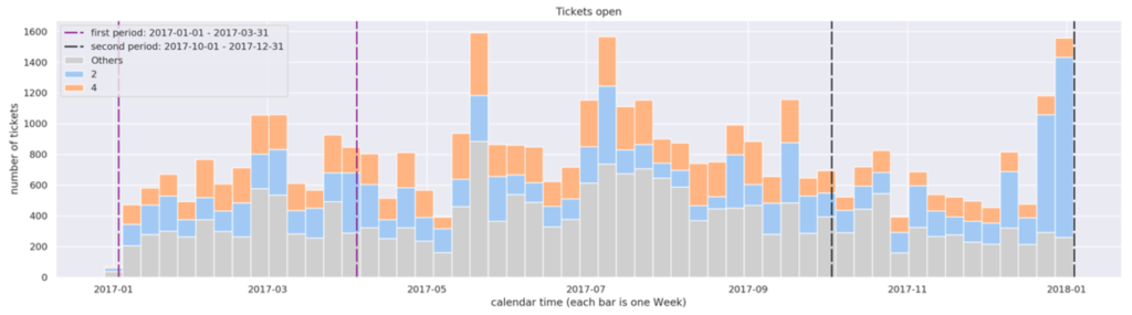
Now the image looks quite different. We can tell that earlier in the year we had more Priority 4 (P4) tickets (orange), which are not critical. Now however, we have an alarming growth of Priority 2 (P2) tickets (blue), which are high priority tasks with tough SLA. Very possibly, our team has recently been working day and night!
The gradual decrease of P4 is a trend which wasn’t visible until we colored the subcategories. As we see, by revealing such trends, we may reach insight that changes the interpretation dramatically. How could we find more trends like this inside the data? Or to be more precise: could we find ALL trends hidden in the data? This is our challenge.
Not easy!
It is difficult for three reasons.
Problem 1: an increase does not mean a trend. The image above is the best example. While the decrease of P4 is gradual and looks like long-term trend, the recent increase of P2 seems a momentary anomaly, rather than a trend. In other words, the growth of P2 has not been systematic
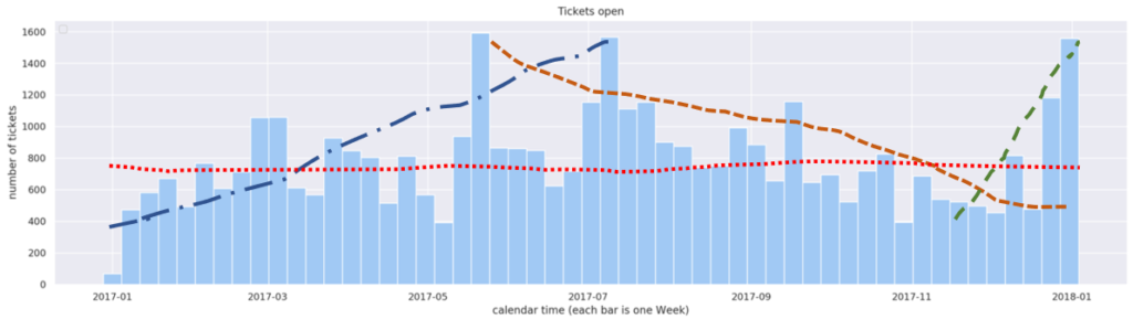
Problem 2: humans are terrible in identifying trends. When I wrote above that the data showed no trends, I was not being precise. Here are four examples of “trends” that can be found. Such pseudo-trendlines are subjective, contradictory and impossible to prove. So we need some metrics, some objective measurement telling us whether the trend exists or not.
Problem 3: there are just too many combinations of categories and subcategories in the data for the human eye to spot the trends line. For instance, the feature Business Service defines the application that the ticket refers to. Then do we have an application showing a trend? Very well, have a look yourself, below are the charts of five example apps:
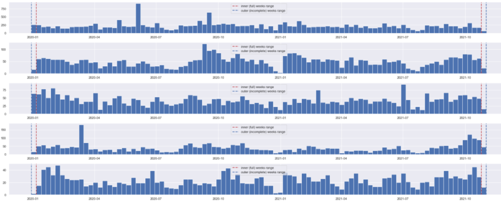
It is already difficult to loo. But this is only 5 charts, while a typical service desk services hundreds or thousands of apps. Not to mention that trends can exist with combinations of features. For instance, there may be a trend with application LDAP, but only when we filter the P4 tickets and the location Frankfurt.
Linear Regression to the rescue
The first two problems can be addressed with the good old linear regression that uses OLS (ordinary least squares) model. This mathematic formula allows us to fit the trend line (red line, below) matching the observed quantities (blue points, below). Below is a sample visual and numeric output of the OLS implementation in Python’s statsmodels package.
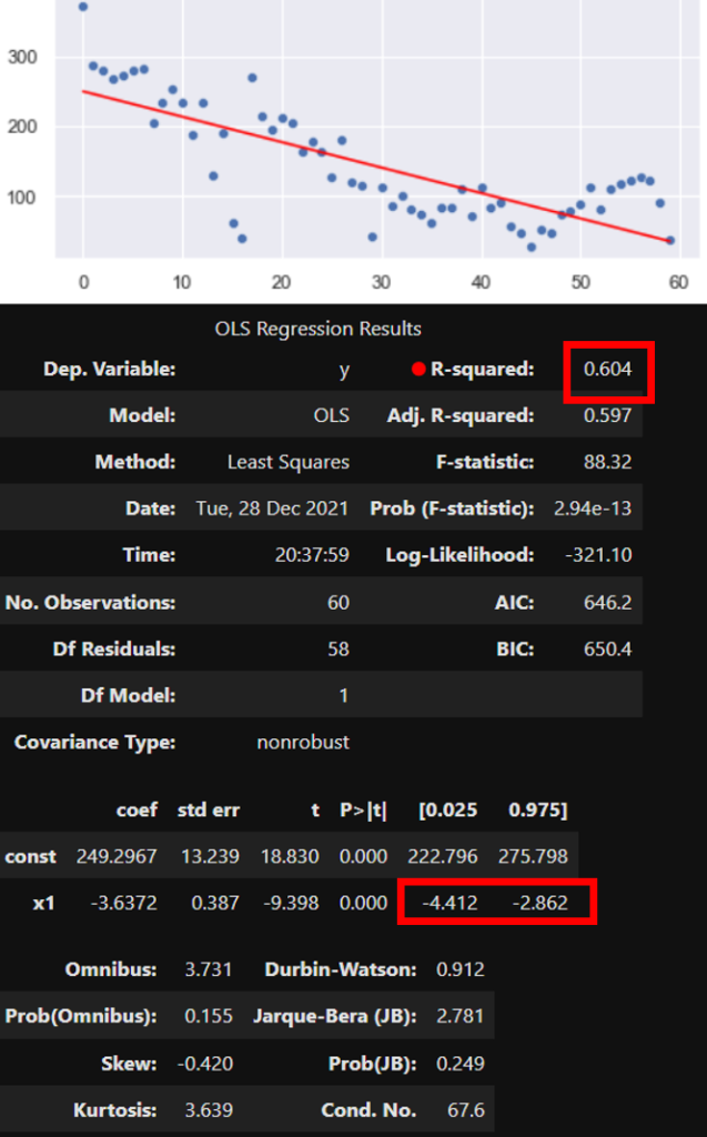
Out of numerous parameters and coefficients that describes the regression model, two (marked red above) are sufficient for the most basic interpretation. First, the R-squared of 0.604 allows us say that the fit is strong. In other words, the straight line represents the observations quite well. Second, the confidence interval (CI) of the slope (“x1”) is well below zero, disallowing any doubt whether the trend exists or not. The statistics says that it does, and it is definitely negative. We can confirm this visually, but we don’t have to. These coefficients are all we need to know.
Now it gets interesting
Boring, so far? Maybe. Now comes the trick which (just last week) turned this 200-year-old pen-and-paper method into a killer app.
Remember the Problem 3 above? There are tens of thousands of combinations of subcategories of data (such as apps, priorities, groups, categories, times of day and week…), which makes the manual, visual hunt for trends impossible.
But as explained above, to find a trend, we don’t really need to draw it. We only need to get hold of the data, and compute the R-squared and the CI for the slope. Then the programmatic solution to problem 3 is:
- loop over all the combinations of data subcategories in the interesting time period
- In each subcategory, compute the OLS coefficients (R-squared and CI for the slope) to see if there is a strong increasing or decreasing trend in that particular category
- display only the handful of categories with the strongest coefficients
Here is the result (internal data anonymized by wavy inserts):
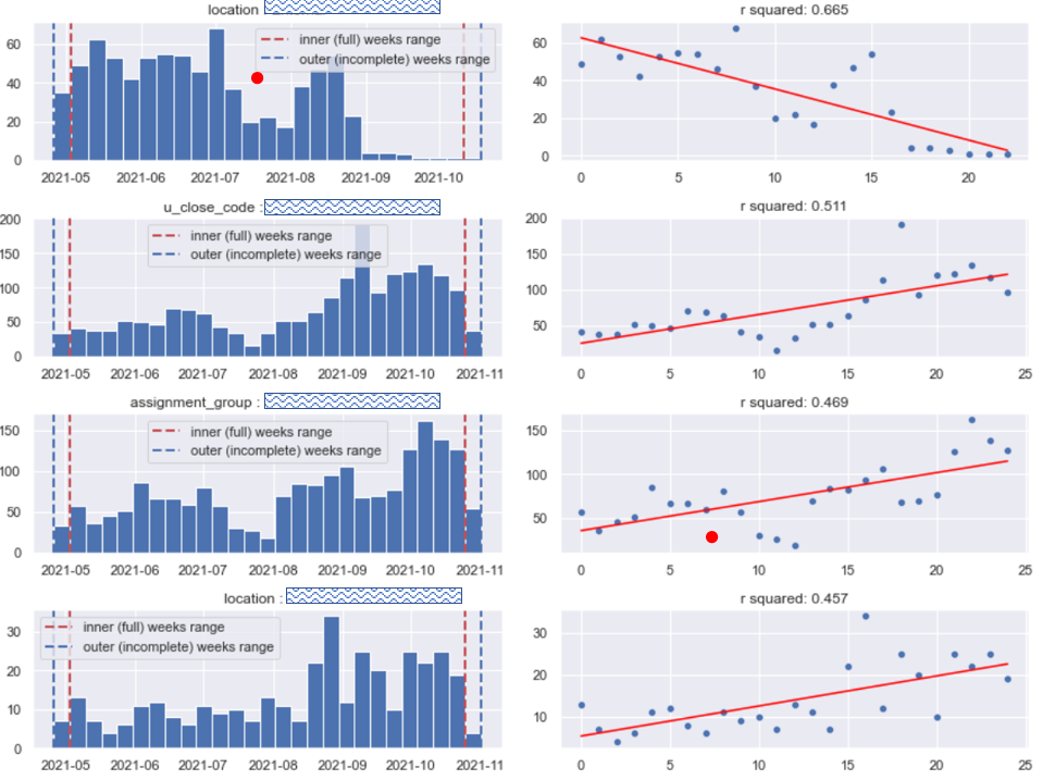
We have analyzed thousands of categories, looking more-less like Diagram A. Most of them were boring, so we discarded them without looking. But we found a few that were intriguing, shown on Diagram B: The volume of tickets from one location decreases, and from another increases. There is one assignment group that experiences increase in workload. Also, the number of tickets with certain close code has grown. Importantly, all those categories exhibit systematic growth (confirmed by the trend coefficients, but also visually above) which allows formulating a hypothesis that the trend may continue in the near future.
How is this cool?
For a data geek like me, it is very cool. Note three things:
- We have established a handful of the strongest trends in data, without looking at the data
- We have not used any advanced data science – not to mention machine or deep learning. All we used is a 19-century cookbook from Napoleonic France, and looped over it
- Our method is low-code and low-maintenance. We do not need to train any models, and we barely need any compute power
This example should serve as yet another reminder that simple methods, often overlooked and generally not popular, should often receive more attention in data science.
This closes the topic. Below some additional comments for those readers who want to follow with similar implementations.
Some final comments and observations
- Admittedly, the regression analysis can go much beyond the rudimentary method described above. Analysis of residuals, adjusted R-square, polynomial fitting are just a few of possible directions. But one needs to adapt the methods to the reality. In our particular case, our trends are intended to inform and inspire the project managers. If so, then rudimentary methods are better, because the cost of false positives is low, while the cost of false negatives is high. In other words: it is better to show too many trends than too few.
- How high must R-squared be? There isn’t a good answer to this question. My practice (specific to the service desk projects) shows that trend lines with R-square above 0.4 are typically interesting, but even those with 0.2 are worth looking at, providing that confidence intervals do not include zero. Note that this is less than most authors would give.
- When looping over categories, those categories with too few values must be discarded
- Looping over features to discard unimportant trends is tricky, because it is hard to normalize the importance of R-squared across categories that have different meaning and volume. For instance, it may be that in the category “application”, trends are interesting when R-squared > 0.3, while in the category “contact type” the limit would be 0.5.
- Seasonality, weekly and annual fluctuations are a separate topic. In general, it is better to calculate trends on relative rather than absolute values, which to certain extent discards this problem
- One real danger that can lead to misinterpretation is p-hacking. If we iterate over thousands of categories, by pure luck we are likely to find some that will like trends. But these may be phantom trends. Our users must be aware of this possibility.
- Credits: I would have not been able to write this without my Sopra Steria colleagues. My Sopra Steria‘s closest team, alphabetically, are: Wiktor Flis, Katarzyna Kopeć, Nagarajan Muthunagagowda Lakshmanan, Konrad Skrzekowski, Mateusz Szybiak, and Tan Tek.