
Garbage in, garbage out. Analysis of untrusted or poorly understood data will yield incorrect results. Hence the textbook approach is to clean the data first, and only then proceed with data analytics. For instance, in the data lakes, the data should be first cleaned in the raw and staged zones. From now on, all that is left is pure pleasure. In the Gold zone, quality problems are gone.
With time I learned to humbly accept that this approach is impossible. Because quality is more complex. Let me illustrate this on five examples.
1. The basics
Some things can be indeed checked quickly. Let’s name them:
- bad formats
- missing data (NaNs, gaps in data)
- Bad values (out of expected range)
- typing errors and other problems related to human factor
- data homogeneity
If that’s our quality problem, then we’re lucky. Let’s move on to more interesting cases.
2. The meaning
Consider this example:
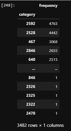
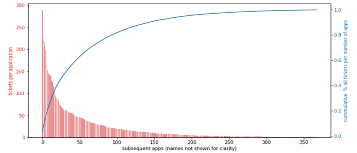
To the right we have anonymized categories. To the left is the frequency of records (in our case, representing tickets or incidents) belonging to each category. We can immediately see the long tail: some categories have many records, but there are many categories with very few records. Here is an example of a categoric feature with similar characteristics, plotted on a bar chart.
Do we have a quality issue? It depends.
If the categories represent logical grouping, designed for organization of work, then we can argue the grouping has been badly designed, and that is the data quality issue: too many meaningless categories. But if the categories represent the factual application names associated with the tickets, then it is not a data quality issue but a fact that needs to be dealt with: some apps throw very few incidents.
This example represents an annoying feature of data quality: it is inherently linked to the meaning. The same may or may not represent data quality, depending on what the data represents. For this reason is difficult to automatically detect quality of new, previously unseen data.
3. Simple visualizations
Here is an example histogram of duration of certain events, in minutes.
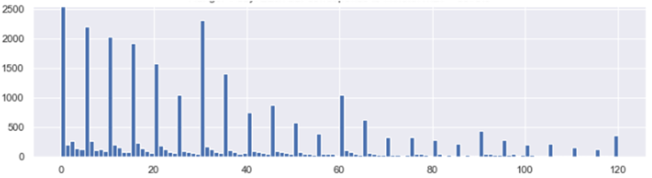
The “zebra” pattern is likely caused by the fact that measurements have been done by a human, rather than machine. The intervals of 5,10, and 15 minutes are overrepresented because that’s how people typically estimate time. So this is not a true measurement, but an estimation. A clear quality issue.
Why is this a bigger quality problem than data formatting? Because you will not notice this issue, until you visualize it. There are other methods too for checking for human measurement error, but to use them you need to know what you are looking for.
4. Comparative study
Here is an example of a variable where a sample was drawn every few minutes, and then the sample mean and sample median was visualized.
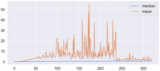
The high variance of the mean indicate high impact of outliers. It would be okay, except that it looked different than historical data:
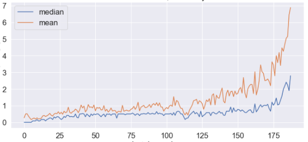
This difference sparked investigation which resulted with conclusion that the new data was corrupt, due to an error in the sample composition algorithm.
What I am trying to show here? The effort and the complexity of reasoning that led to discovery of a quality issue.
5. Advanced transformations
Below is an example of advanced visualization of data: relationship between two features plotted on log-log scale (both axes x and y are logarithmic).
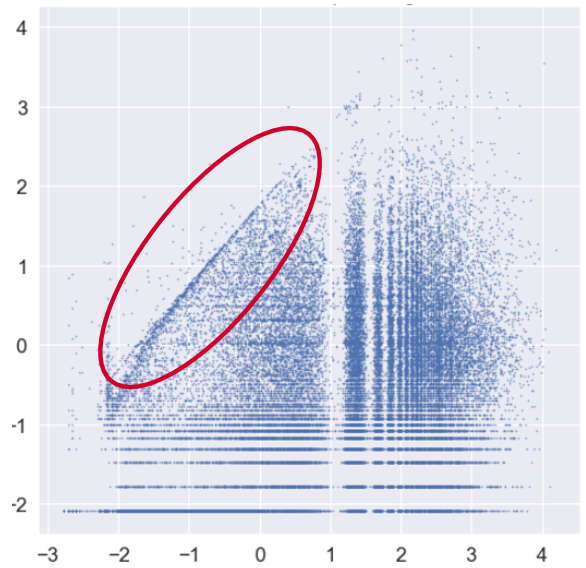
It is not easy to interpret the diagram. After careful study we understood what the horizontal and vertical structures come from, but still had trouble with one last feature of the image, which looked as a slopped boundary in data density (marked by red oval above).
We finally found it resulted from data corruption. In this particular case, the data represented cost prognosis submitted by users. The ranking was biased by automatic hints and this is what the boundary represents. The quality issue here is that two variables (the rank and the hint) have been tangled. In the effect, the measurement is not trusted.
This example shows an arcane quality isue discovered almost by chance, only after complex transformations and over-average scrutiny.
Summary
Of the five stories above, only the first can be automated. In the remaining examples, the data quality issues have been well hidden. They are not similar to each other and their identification required detective skills.
Data Quality is intrinsically tangled with the data understanding in such an (irritating) way, that puryfing the data in the early stages of the project is, in my opinion, unreallistic. Rather, the process I have in mind can be illustrated by peeling of an onion. While the project develops, and our understanding grows, new quality issues will be discovered.
I struggle to understand how such process could coexist with a “proper” design of a data lake or a data warehouse.