Skip to content
OnData.blog

OnData.blog

Menu

  • Articles
  • By topic
  • About
  • Linkedin
  • Facebook
  • twitter
  • RSS

clustering

Simple hack to improve data clustering visualizations
Simple hack to improve data clustering visualizations

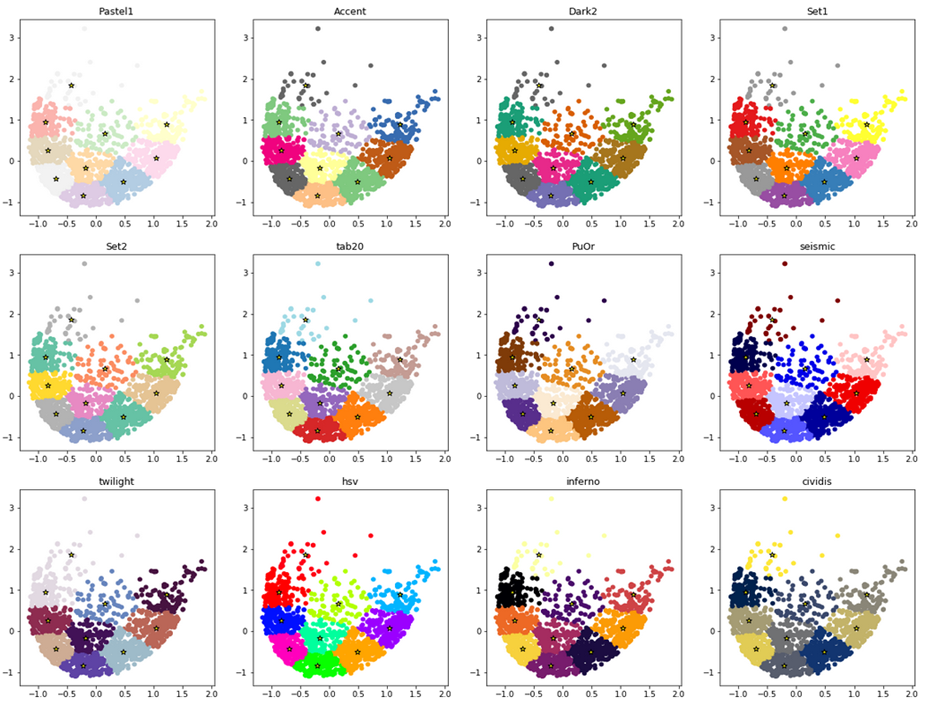
Here is how to make your data clusters look pretty in no time (with python and matplotlib), with one-liner code hack. I wanted to visualize in python and matplotlib the data clusters returned by clustering algorithms such as K-means (sklearn.cluster.KMeans)

Pawel Plaszczak October 8, 2019October 10, 2019 Articles No Comments Read more

How to isolate data that constitutes a spike in histogram?

How to isolate data that constitutes a spike in histogram?

We would all love to spot business problems early on, to react before they become painful. You can learn a lot by looking at past problems. Hence, understanding the nature of anomalies in data can bring substantial operational benefits and

Pawel Plaszczak October 1, 2019November 20, 2021 Articles 2 Comments Read more

Recent Posts

  • Data Literacy: Six examples of bad data interpretation April 29, 2024
  • Porting PyTorch neural network to Amazon AWS June 30, 2022
  • Porting pyTorch cloud detection model to Amazon AWS S3 June 17, 2022
  • pushing data to AWS. SageMaker sucks. So does Anaconda June 14, 2022
  • Linear Regression: Killer App with 19-century maths January 19, 2022
  • Democratization of statistics: Chi2 for non-experts January 12, 2022
  • An approach to categorize multi-lingual phrases December 15, 2021
  • The implications of Scikit-learn bug #21455 November 29, 2021
  • Your model may be inaccurate November 25, 2021
  • Answering Why (with Chi-Square) November 19, 2021
Copyright © 2025 OnData.blog. All rights reserved. Theme Spacious by ThemeGrill. Powered by: WordPress.