We would all love to spot business problems early on, to react before they become painful. You can learn a lot by looking at past problems. Hence, understanding the nature of anomalies in data can bring substantial operational benefits and know-how. And that’s the background for this work.
I have identified an anomaly in data, which shows as spike in the histogram. In other words, the anomaly lies not in the data itself, but in the data density. I would like to identify the data points that make up the anomaly, separating them from “normal” data points as illustrated on the diagram below. How to do this? The data comes from database table with 200 categorical features, which is sparse (most fields are missing).
Before going further: the inspirations here come from work I’ve done for Sopra Steria Apps in Katowice – home for some really exciting projects, so check it out.
[Update 2021-11-20: I lately published a new article, covering a similar problem and proposing a simpler method, namely the Chi-Square test for independence]

Explaining the problem
I am having a data set of several millions data points. Imagine each data point represents an an event in some monitored infrastructure (ITIL/ITSM/IT Service Management), characterized by a time stamp and some 200 atributes. Most attributes are categorical, only a few (mostly timestamps) are continuous. The events grouped into a histogram along one of the continuous dimensions, show concentrations at certain regions which represent anomalies, like this spike:
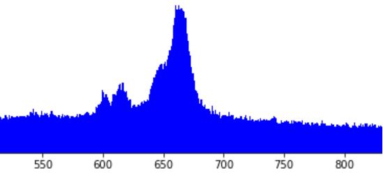
We want to understand the nature of the anomaly. For this, we would like to distract the “weird” events that make up the anomaly. Our hypothesis (driven by intuition) is that those data points should be somehow different from “normal” data points. Further, we think that in the region of interest, only part of data points represent an anomaly, while remaining data points represent an ongoing “normal” activity. Thus, if our hypothesis is correct, we are looking for a clustering technique that would separate the data rougly as depicted in the left diagram below: “normal” population in black, and “anomaly” in red. Notice that in the region of interest, that is between 640 and 680 along axis X, both populations coexist. In the contrast, the right diagram below below represents an alternative grouping, which is much simpler to achieve and… useless. This is not what we want.

How to achieve the grouping we want, optimally with standard Python, Pandas + scikit-learn stack?
The solution
I will skip the (otherwise very interesting) thought process and will proceed to the solution I am currently exploring. It works, however I am quite sure there is vast space for improvement and I’d be looking forward to see comments on how to do things differently.
I first identified some of the anomalies, and sliced the data around them thus reducing the data to the region of interest and some small area around it. I did this to speed up the computing of the algorithms that I will show below. I tried to make an intelligent guess, cutting the shape so that the finally discovered sets would be reasonably balanced, possibly in the 50/50 ratio. Here are four of the anomalies selected:

I then used statistical techniques in the attempt to transform the sets into separate groups, based on the categorical variables. The difficulty lied in the fact that most of those techniques do not work well with categorical data. After several trials and some reading, I have reached most promising results with the following routine: (1) manual dimensionality reduction down to 10-20 most promising dimensions based on domain knowledge, (2) thoughtful replacement of empty values with fillna() – stop here to think how this will impact Gower score (3) building the (dis)simmilarity matrix between those data points with Gower distance metrics, (4) applying the similarity matrix as an argument to t-SNE (t-Distributed Stochastic Neighbour Embedding) to come up with the final grouping. I reached result similar to the diagrams below.
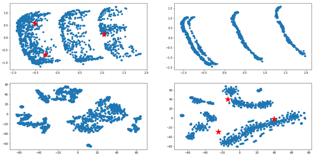
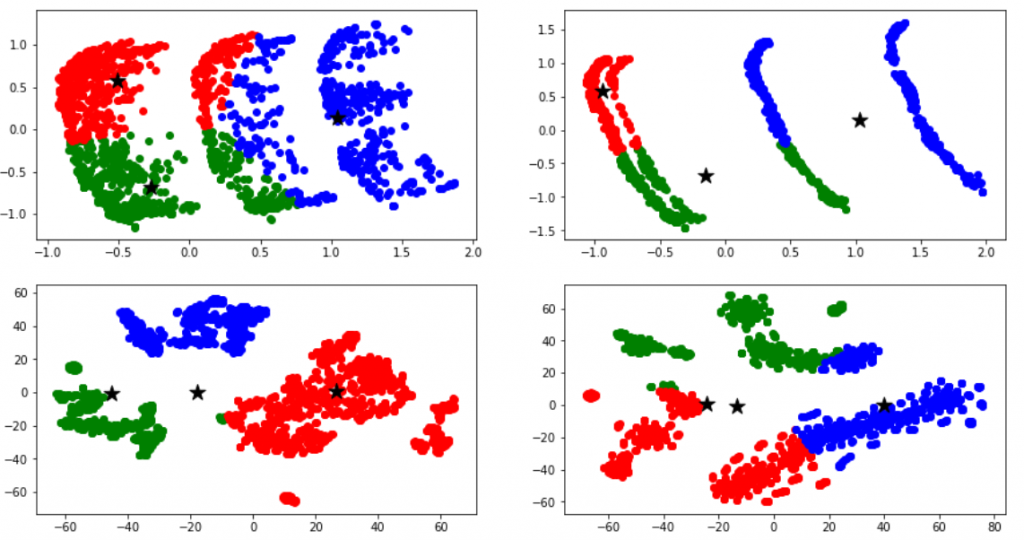
Once I could visually attest that the result looked promising, I then attempted to apply various clustering methods (k-means, … etc) to those sets, in the hope to programmatically tell the sets apart. As can be seen below, the initial results were not satisfactory at all (the computer did not see the clusters the way a human would) but finally I ended up with quite reasonable results, like the bottom-left diagram below. I am sure these could be perfected with enough effort, but for the moment this was good enough:
At this point I had the clusters I wanted. Now however, it was time to check whether some of those clusters represented the anomaly we started with. For this I had to attach the newly discovered cluster labels back to the original data representation, and redraw the original histograms in the stacked color mode. Here are some of the results initially achieved…
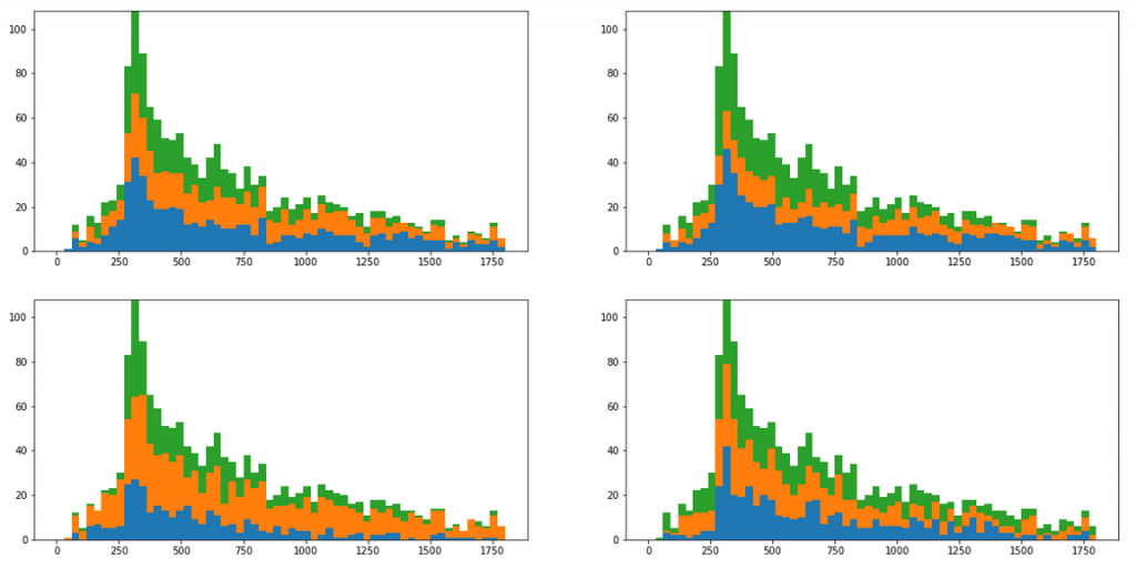
Those initial results do not look too good, as the clustering did not correspond to the spike observed as the anomaly. However, after some more experimenting I was able to come up with a lot more interesting outcome, like the two propositions below.

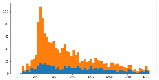
I am not fully satisfied with these, but I think they are promising prototypical results, good enough to demonstrate that the procedure described above could make sense. My next steps now would be to improve the results by hyperparameter tuning and apply the knowledge in practice. Quite obviously, being able to the tell the anomalous events apart from “normal” ones, bring a number of operational and very practical benefits.
Problems encountered on the way
Here are some technical difficulties I encountered, and here is how I solved them:
- Even after substantial reading reading, I did not find any single best practice for what I was trying to do. In the result I considered and tried various techniques, and the amount of these slowed down the work.
- Some online resources that helped me include: this towardsdatascience thread (PCA, Gower metrics, PAM / partitioning around medoids, Visualization in a lower dimensional space, with t-SNE), this researchgate thread (Two Step Cluster Analysis, PAM algorithm with gower distance, k-prototypes), this Quora thread (distance matrix from Random Forest based proximity, ROCK clustering, K – Mode clustering), and this stack-exchange discussion (non-metric multidimensional scaling (MDS) and tSNE)
- scikit-learn turned to be an inadequate tool for the problem. Many of the algorithms needed (mentioned above) were not implemented
In addition to tech problems, here’s some strategic / conceptual questions I am looking at:
- the path described has too many steps and every steps has hyperparameters. It is almost unmanageable when it comes to hyperparameter tuning
- we have shown visually that the anomaly spike stands apart, but…aren’t we pleasing ourselves? How do we prove this segmentation is not artificial, being pure result of our wishful thinking?
- how do we generalize the concept? Once we’ve identified one anomaly, can we reuse the knowledge to automatically identify more of them? For instance, is it safe to use the labels achieved, to train a ML classifier to classify other samples? Does it make logical sense at all? Perhaps we could rather derive that knowledge directly from t-SNE algorithm we already used (how?)
- I also noticed the process of clustering was nondeterministic. When building gower/tsne/clusters on a data sample (for faster processing), the eventual shape of the clusters for various samples of the same data did not even resemble each other. What comes in mind is a butterfly effect (small modification of sample seems to result in significant modification on the outcome). This brings up the question on the veracity of the conclusions we are reaching.
That’s it, hopefully useful to someone. Again, this work was possible thanks to my project for Sopra Steria Apps in Katowice, Poland. I am looking forward for comments, inspirations or critics from anyone doing similar work.
Post Scriptum & Footnotes
2020-06-29: One year after writing this article, I tackled similar problem and understood that other methods can be superior than those presented here. Those methods are unfortunately manual and time consuming but more practical if the goal is to gain the insight inthe data: How to split a bimodal distribution
2021-11-20: I lately published a new article, covering a similar problem and proposing a simpler method, namely the Chi-Square test for independence

Amazing content, and well presented as well!
When you said:
“I first identified some of the anomalies, and sliced the data around them thus reducing the data to the region of interest and some small area around it”
I was wondering what kind of logic/algorithms did you use to slice the data in the histogram?
I’m thinking it could be some histogram operation/technique, but I could be way off!
Thanks
Thank you Robert. No, this kind of data slicing can easily be done manually, not on the histogram but directly on the dataframe that the histogram represents. Just remember that histogram is nothing else than frequency distribution of that dataframe records over certain axis. So for example, if that axis is time, and we want to focus on the events that occured 4:00 am, then you just filter the dataframe for the data records between 3:30 and 4:30 am, and that’s your data slice.