
For the Data Puzzle I posted last week, I received about a dozen of thoughtful and highly relevant answers. THANK YOU. I want to primarily thank to Luis Ruiz Santiago, Chetan Waman and anonymous J for comments under the previous post, Marzena Rybicka-Szudera and Riesz Ferenc on Facebook fanpage, and Damian Drąg, Paweł Lis, Deb Vasha, Alfredo Jesus Urrutia Giraldo, Jacek Skoczek and others, who contacted me in private or through Sopra Steria intranet groups. I will announce the winners below the article. But first, the explanation.
The short answer: in fact, the relationship between the variables is positive (in other words, when time spent grows, the resolution delta also grows). Just the visualization is deceiving. If this surprises you, read on.
The deceiving right-skewness
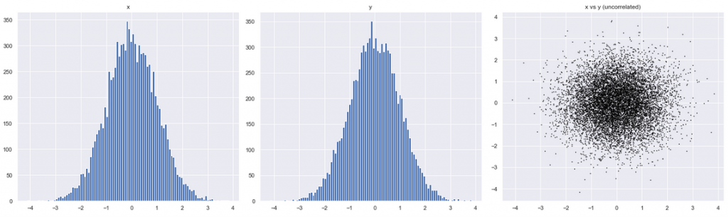
First, let’s understand better what we expected to see. The expected scatter plot from the previous post could be improved it a little, noting that the correlated variables may have some distribution. Assuming Gaussian (normal) distribution, the result may look like the right chart below: I call it a marching ant colony:

And how would that chart change, if the two variables had no relationship whatsoever? The ant swarm is now circular:
Actually, we can check whether the relationship exists without even plotting anything. The statistical tools are Pearson or Spearman correlation coefficients:
df[['timespent', 'rdelta_h']].corr(method = 'pearson')
df[['timespent', 'rdelta_h']].corr(method = 'spearman')
The result of both methods (0.31 and 0.32) show medium-weak positive relationship. This is interesting! Statistics confirms our expectations that timespent and resolution delta are positively correlated. Then what is wrong with the visualization ?
Importantly, our assumption was the Gaussian distribution of the variables…but is this the case? Let’s examine the histogram of Resolution Delta alone:
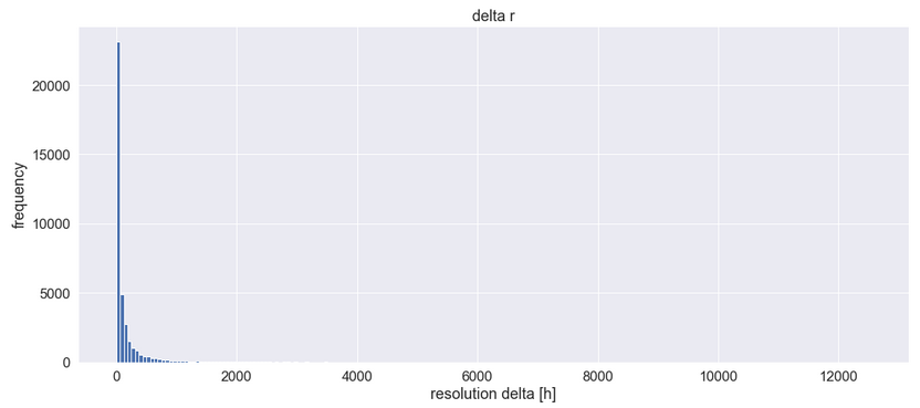
The majority of values are tiny. The distribution is highly right-skewed (it has a long and thin right tail) and does not resemble the Gaussian bell curve at all. Instead, it may be similar to a log-normal curve (a sort of distorted Gaussian curve, squeezed to the left). In fact, distributions of lifetime of events often behave this way. I won’t show the histogram of our second variable, Time Spent, because it looks almost the same.
Then let’s update our assumptions. How would our chart in Figure B look, if both variables had log-normal (instead of “normal” Gaussian) distribution? For this, I plotted against each other two artificially generated two log-normal distributions:
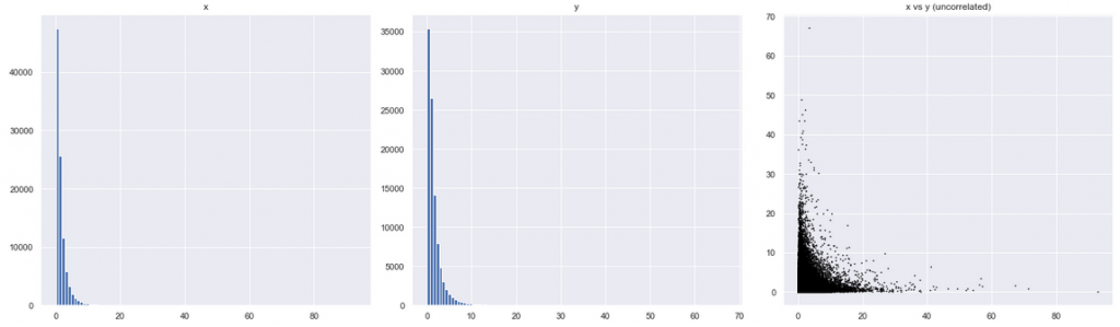
The image to the right looks very much like our original puzzle! This means that we might have been deceived by the visualization. We thought that the original chart showed a negative relationship between two variables, but it didn’t! It showed no visible relationship between the variables. The tails extending vertically and diagonally resulted from the fact that both distributions simply had more small values.
Then where’s the relationship?
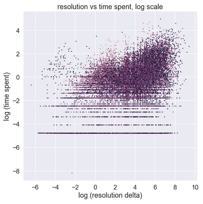
Now, one thing still needs to be explained. The chart showed no visible relationship, which does not mean there isn’t one. Note that Pearson coefficient earlier suggests that the relationship should actually exist. Let’s see if we can observe this visually. To do this, we need to somehow get rid of the right-skewness which is obstructing the view. In other words, we need to transform the data, so it is visible more centrally, because the current chart is not very informative. The way to present a log normal (-ish) distribution it is to change the scale of the x-axis to logarithmic. Here is Figure C modified that way:
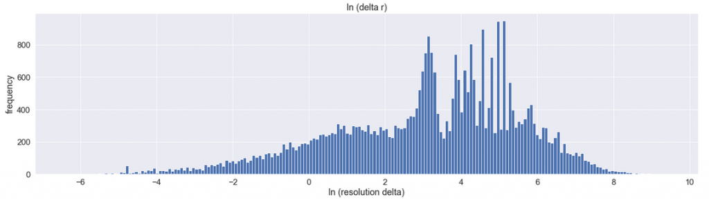
Here’s how to read this diagram: on the x-axis, the label [0] represents 1 hour resolution time (because e**0 = 1). Label [2] represents 7 hours (because e **2 = 7). Similarly, [4 ]= 54 hours, [6] = 16 days, and [8] = 125 days. The logarithmic scale is useful because it expands the interesting right part of the diagram, while shrinking the less-interesting right side of the diagram. In effect, it shows more detail on each of those sides.
That much about the Resolution Time. Now, our second variable, Time Spent, is also strongly rightly skewed. Now, what would happen if we redraw our original scatter chart, using logarithmic scale on both variables? Here’s the original chart:
And here is the same on logarithmic scale:
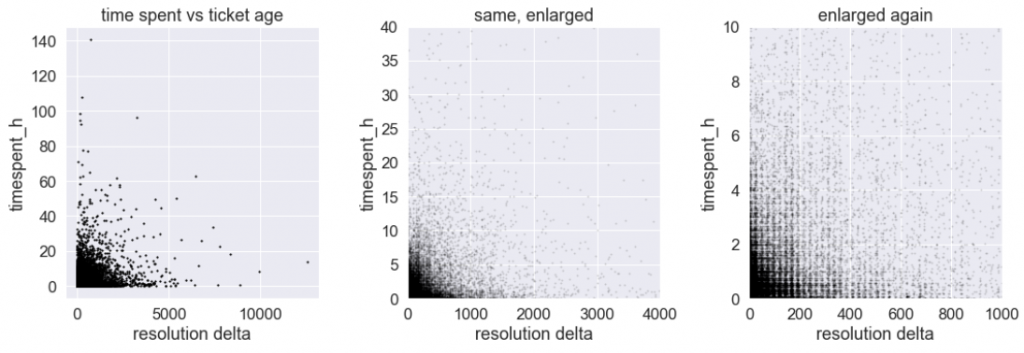
It looks… very different! The horizontal features towards the bottom should be ignored, as they represent limited resolution of the measurements: time spent is measured with 1-minute intervals, and so the bottommost horizontal bars indicate minute 1, 2, 3 and so. It is the upper right corner which is interesting. Here it is again, shown in a few ways.
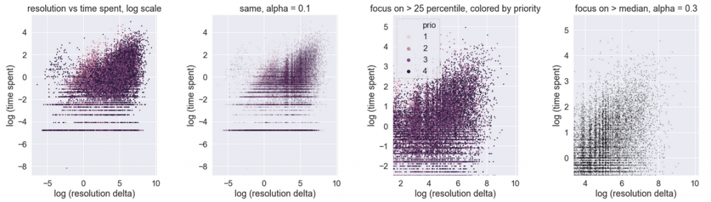
We observe that the data, after transformation that removed its log-normal nature, demonstrates a shape in between Figure A and Figure B. The ants are a bit sleepy, but slowly start marching towards the upper right. The interpretation: the relationship between the resolution delta and time spent is positive. It is not very strong, but it certainly exists. This interpretation matches the earlier Spearman and Pearson coefficient rank results.
To confirm this in a more vivid way, we can also prepare the following alternative visualization: sort all the events by the resolution delta, then divide the sorted set into batches, and for each batch calculate the median (or mean) time spent, and the median (or mean) resolution delta. Here are the results, shown in two ways:
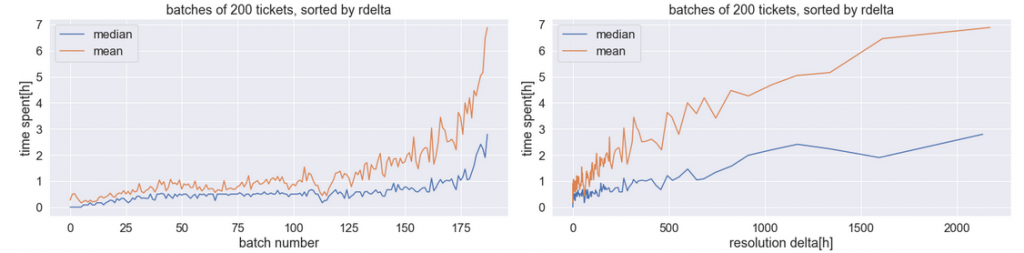
This time the positive relationship is quite obvious. The right chart demonstrates why it is not very strong: the median time spent (blue), which is in the range of 0.5 hours for very small values of resolution delta, only increases to 1-2 hours for very large values.
The answer
Let’s summarize what happened. The original chart seemed to show negative relationship between the variables. But in fact it only reflected the shape of distributions: both of which were strongly right skewed. The skewness was so strong, that it obfuscated the relationship between the variables.
This however does not complete the discussion, because more insight came from the readers.
The discussion and the winners
The answers from readers fell in two groups. The first group came from Service Desk domain specialists. They indicated interesting domain-specific factors (business-driven, psychological and related to personnel motivation) that may influence the relationship between Time Spent and Resolution Delta. The Second group of answers came from Data Scientists and statisticians. Actually, both standpoints make a lot of sense and contribute to understanding what is going on here.
In the discussion above I focused on the statistical aspect of the data, which contributed most to the confusion. The best answers came from Riesz Ferenc and Paweł Lis, who independently observed that the chart depicts distribution, rather than any relationship between the variables. Congratulations ! In addition, Paweł indicated another useful model to describe what we see: Gamma distribution.
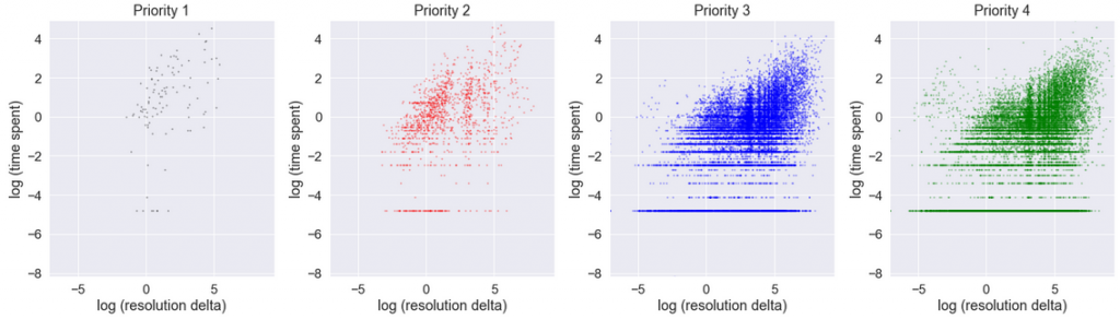
Other readers, Luis, Chetan, Marzena, Deb, Damian and Alfredo indicated the importance of business parameters of tickets: most importantly priorities, SLAs and personnel motivation. How very true! Actually, the related statistics in our data set are striking: in Priority 1, median time spent is 7 hours, while median resolution delta is 21 hours. In contrast, in Priority 4, typical time spent is 1 hour (shorter!), while resolution delta is 173 hours (longer!). In fact, tickets with various priorities could well be analyzed in complete separation in four distinct groups, because they are subject to different business processes. The correlation between time spend and resolution delta in each of the prioritized groups, taken separately, is stronger (especially P1).
However, in our particular chart those aspects did not contribute highly to the phenomenon observed, because P3 and P4 tickets are numerous, while P1 and P2 are in minority:
Finally, a special distinction to one anonymous comment from J, for the most intriguing suggestion: Benford’s law could be used in order to check whether the data has been manipulated. I was so perplexed that I made an effort to check how my numbers matched the Benford distribution. And … they don’t. But this I will cover in a separate article, time permitting.