
Here is a new data puzzle, coming from my recent analytics in Sopra Steria. I will describe the problem, but not the answer. If you like the challenge, please contribute your thoughts in the comments. The title of the data puzzle is:
Resolution delta versus time spent
I work a lot with Service Desk data. The data points represent the tickets we receive from clients. Each ticket indicates an incident – some technical problem that needs to be fixed. In this work I am frequently puzzled by various data phenomena. Solving them is fun. Some past ones are: The truth behind histogram dent or The phantom I followed.
The problem I tackled this time is related to the resolution delta of incidents. The resolution delta is the time that has passed between the incident open time and the incident close time. The open time field is assigned automatically by the system when an incident arrives. The close time indicates the moment when the problem has been solved for good.
How long are those resolution deltas? Often hours or days, due to the fact that after work has been done, the ticket comes into state ‘resolved’, which triggers an observation period or request for client feedback. Only after this, the ticket can be marked ‘closed’.
The resolution delta has one disadvantage. It does not represent the ticket cost, expressed in the man-hours of the specialist who fixed the ticket. Therefore, some projects introduce the ‘time spent’ field, which is supposed to contain the billable time that an engineer actually spent on the job. As an example, a ticket might have a resolution delta of 6 hours, including 2 hours of time spent, and 4 hours of waiting for client feedback.
The puzzle
In order to understand the data, I tried to visually plot the relationship between the time spent and the resolution time in one project. I expected to see a linear relationship (this is a scatter plot, where each dot represents one ticket):
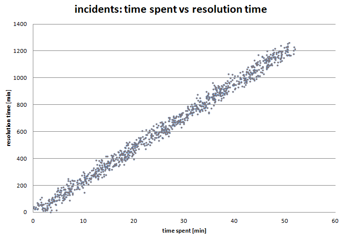
In my reasoning, easy tickets, with small consumption of time spent should be resolved and closed faster, while difficult tickets with large consumption of time spent, should be resolved later. So the two values should have a strong positive correlation.
However, to my surprise, the plot came out like this:
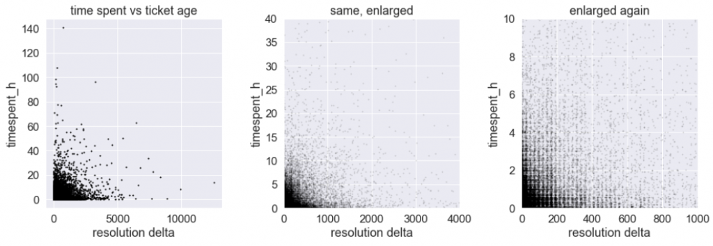
We are again looking at a scatter plot, where one dot represents one ticket. However, the relationship seems to be the opposite of expected. Tickets with high resolution time (upper left part of the diagram) always have low time spent. In contrast, all tickets with high time spent (bottom right part of the diagram), have consistently low resolution time.
The puzzle is: how to explain this chart? Is it logically possible that the correlation between those two variables is negative? Why?
If you think you have an idea, please submit it in a comment below, or if you prefer at my Facebook fanpage. Good luck and have fun!
Update (30.3.2021):
The explanation: The Data Puzzle Explained.
One possible approach to understanding this would be how the company handles and prioritizes ticket handling. If a ticket is more complex, my guess is that people will prioritize those tickets and leave the perceived simpler tickets hanging until the large ones are resolved. The why of this prioritization would be key. Are there enough people to handle all the tickets in a timely manner? Why would there be so many complex tickets coming in that would take the focus away from simple tickets? Is there something in the system that causes issues for clients?
HI Mr. Pawel,
I have worked on the service tickets before. We used to have a priority set for each ticket and mostly the high time spent used to be an urgent task that has coverage from the management and was critical for the business. hence those high priority high time spent tickets used to be addressed and closed first.
If I consider the 3rd small graph from left to right. The first vertical strip of blocks will be high-priority tickets. middle 2 verticle strips medium priority and last 2 strips for low priority.
Donno If I was of help, but the additional variable of priority will better explain the relations.
I totally agree with both previous comments. Let me add something.
If some tickets are opened manually by the support agents, there are some unfair practices that may have significant impact on the ticket age (resolution time):
– an agent postpones submitting a ticket until the resolution is known, or an expert is available to help him troubleshooting the issue. It gives more chances to save SLA targets.
– an agent resolves a ticket too soon, while it’s not proofed the issue is definitely resolved, or the customer has left for weekend/vacation. Some customers forget about the issue after the weekend or don’t manage to reopen such ticket (the observation period started on Friday and he’s busy on Monday), so they will create a new one. Again, SLA is saved, and the resolution time doesn’t reflect reality.
Such practices might be applied for any kind of ticket, no matter what’s the priority, but I bet it’s more common for higher ones (let’s say for 2 highest levels in 4 level scale). It’s all about SLA-oriented culture.
Some other options: a ticket was abandoned (yes, it happens) for long time, yet the time spent to resolve the issue was short.
A ticket was not abandoned, but communication between an agent and a customer took so long that the ticket got very old. Again, the time spent would be much shorter than the resolution time.
Besides, if the “time spent” is entered arbitrarily by an agent, and nobody checks the values, you may need to employ sociology, psychology and Benford’s law to verify and understand the data.
I appreciate all responses, Luis, Chetan and J. Each one adds some aspect, some of that I didn’t even think of. Essentially, all of you, as business insiders, correctly indicate that there are important reasons (business-driven, psychological, or even such that show an unwanted consequence of badly designed incentive schemes) that may influence the relationship. Some of those reasons can only be assumed, as they won’t be visible directly in the data. I like all three answers. There are a few more answers on the facebook page, attacking the problem from yet another angle: purely statistical. In the coming days I shall put all this together and I will post an article explaining the phenomenon. Meanwhile, please keep posting if you have more ideas.