When you really want to find a pattern in data, you will. Even if there is no pattern. What happened to me yesterday was embarrassing… it also is a lesson worth sharing. I learned how to interpret unusual data patterns, looking like this:
I am looking at data from the Application Management domain. Our Service Desk works on tickets, which represent incidents manually reported by users. The reporter arbitrarily assigns ticket priority: Minor (4), Major (3), Critical(2), or Blocker (1). For frustrated users, it may be tempting to ramp up the ticket priority. Perhaps … a minor issue could be marked major, for faster resolution? The data can tell us whether people really do that.
My data set contains a history of thousands of reporters, each of whom submitted an average of 50 tickets. I wanted to check whether users are consistent in their assessment of the priorities of their problems. For this, I grouped the tickets by the reporter and checked the lifetime average priority of each reporter (counting all tickets that this reporter has ever submitted). Supposing the users perform similar work, and their behavior is rational, their lifetime average ticket priority should be similar to each other. This may mean that users’ assessment is methodic, rational, and essentially they don’t cheat. And so the incident priority can be considered a trusted metric for further analysis. Is this the case?
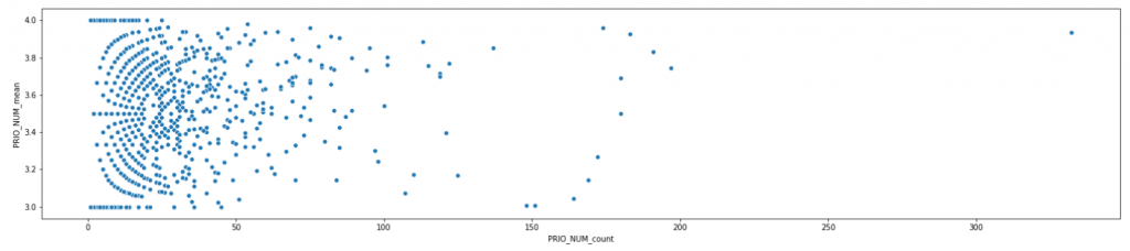
I work with python (with numpy, pandas, matplotlib, seaborn, and scikit-learn). To verify the situation, I first plotted the scatterplot, where each user is represented by one dot. The axes show the number of tickets per reporter (x) against the average ticket priority for that reporter (y):
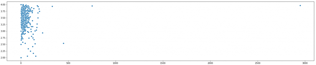
On the first look, the assessments are highly inconsistent. But scatterplots are tricky. Let’s zoom in.
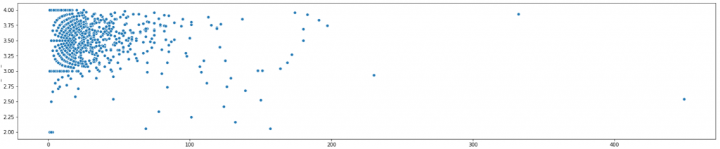
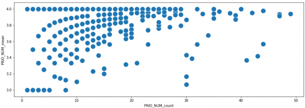
This starts looking interesting. I was surprised to see the circle-like formation in the upper left corner. Let’s zoom in even more:
As we can tell, the relationship between the number of tickets the users submitted, and the average priority is bizarre. Below, let’s zoom in once more into the upper left section of the chart showing users who submitted between 0 and 50 tickets, with average priority 3 – 4. Moving along the x-axis, that is from left to right, we may to some extent follow the growing maturity of user behavior, as they submit more and more tickets. It looks that users “travel” along some pathways during their careers.
The phantom
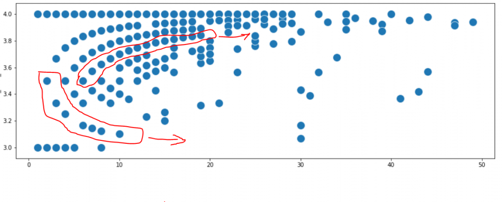
It seemed that some users start with ticket priority 4.0 and never go away. Other users start with priority 3.5 of their initial tickets. Then, as they submit more tickets, some of them are attracted downwards to priority 4, and eventually, all their future tickets get priority 4. Some other users are attracted upwards to priority 3, so the more tickets they submit, the average priority becomes closer to 3. Below I marked two of those hypothetic pathways.
Now, however, why is this happening? And what dictates that a user becomes attracted towards 3, or 4?
This looked so bizarre, that my first hypothesis was the data error. But there was no data error. I checked.
My second hypothesis was that the priorities I was looking at had been tampered with. Maybe these were not the original priorities, originally provided by the reporter. Maybe the priority was later changed by the system, with some algorithm punishing some users (always degrading them to lowest priority 4) and rewarding some other users (always upgrading their incidents to higher priority 3). Now that I had a hypothesis that looked reasonable, I tried to prove it. Why were some users systematically punished, and some other rewarded? and more interestingly, why were there not one, but several pathways of punished users?
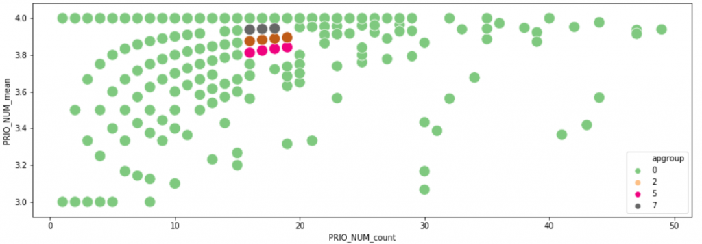
This should have to do with user characteristics or user behaviour. Maybe the user affiliation played a role? or the products they typically worked with? To test this, I manually extracted the individual names of 11 users in a similar situation (15-20 tickets each) of whom I could clearly see they were on three different pathways. Here they are:
then I looked at the statistical correlation (chi-square, Cramer’s V, Pearson, Spearman), between the fact that those users were following different pathways, and other categorical and numeric features describing the users. In other words, I was trying to find a hint on what determines the pathway. The results can be seen below, represented as a heatmap. The variable representing the pathway is called set (the names of those other features have been erased for confidentiality):
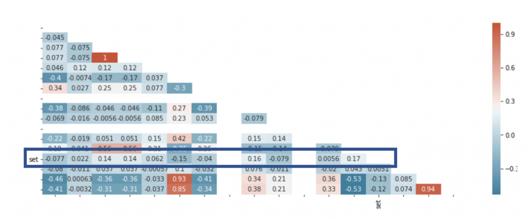
Heatmap is easy to read because strong colors indicate a strong correlation. And well, this is a spectacular failure. This feature does not correlate with virtually anything. In other words, there is nothing in the data that could explain why users travel along certain priority pathways in their ticket history.
The aha moment
Then maybe the pathway hypothesis had been wrong, and we had to think outside the box. I looked carefully and I saw more pathways, now going more diagonally… The aha moment came when I realized this resembles the moire pattern, familiar because it reminded me of my first computer program in the 1980s. I wasn’t looking at any relationship in the data. I was looking at simple mathematics. Really simple.
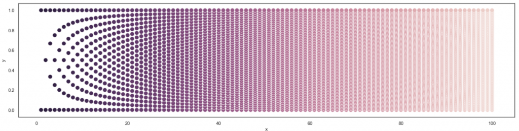
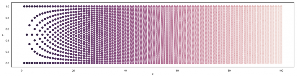
Let’s for the moment assume that the reporters are only allowed to submit ticket priority 3 or 4. For various technical reasons, this may actually be the case. Let’s look only at novice users who submitted between 1 and 4 tickets.
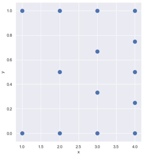
The leftmost column represents users have submitted only 1 ticket. Then, the average priority = 3 or 4. There are no other possibilities. So, two dots only in the first vertical row.
More towards the left in the second vertical row, are the users who submitted 2 tickets each. How many different averages can there be? only three: 3, 3.5, and 4. So, three dots in that row.
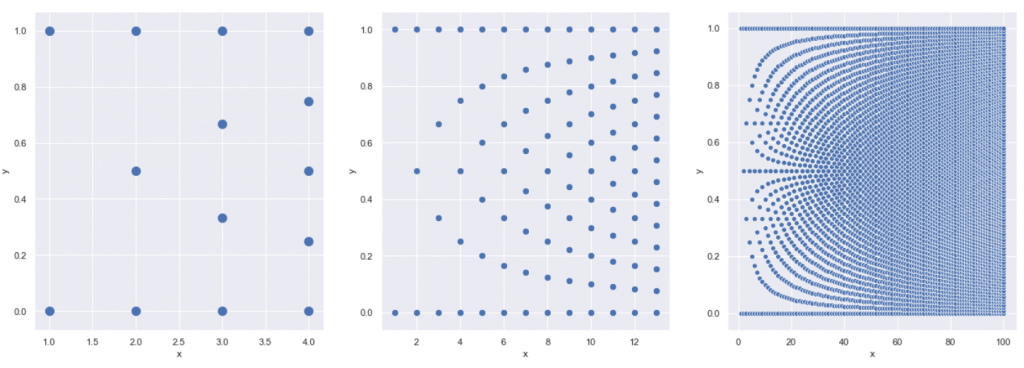
Similarly, in the third row, there are 4 possible averages, and in the next one, 5. If we draw more rows (below, middle), the familiar pattern starts appearing. Below is the same pattern, extended to 13 rows, and to 100 rows.
In the essence, the pattern which I observed shows nothing more than all possibilities that exist in the data. The dots are there, because that’s the only location they can be. There are no pathways that users follow in their career…. I have been following a phantom. Unfortunately, humans have a natural tendency to perceive imaginary patterns where there are no patterns. A so-called apophenia is a phenomenon known to psychologists and… yes, data scientists. We all fall victim to apophenia sometimes. This is especially tempting when the patterns are aesthetically pleasing.
Turning this into something useful
Then… have we discovered anything? Interestingly, almost all marginal dots were taken, forming a complete pattern towards the top of the diagram. But they shouldn’t be. Statistically, the data should cluster more towards the center, while the edges should be emptier, with some dots missing.
But scatterplot is not the best tool to analyze this. For those interested, the story is continued in this follow-up article: do people cheat?
As the final note, it was interesting to observe that the most spectacular data feature, shown again below, was not the one worth following. On the other hand, features that show unexplained symmetry should always be disturbing to the researcher, because they often indicate data errors. So it is not safe to proceed without explaining their origin.