I love mountains. Some of my dear ones say that this is only because they resemble histograms, which I love more. Not true (ha ha), but I must agree that visualizations done properly brings plenty of satisfaction. Histograms, when prepared hastily, often distort the truth. Therefore, sometimes after the research is over, I spent significant time (usually too long) tuning the visualization. Here is a little something from yesterday that I am quite proud of:
Last week I continued and improved my work on identifying anomalies in data drift situations, described in the previous article. Below is a histogram (frequency distribution) showing tickets (alerts or events indicating technical problems) from a certain project, aggregated by the minute of the day, from midnight to midnight (x-axis). These tickets have been collected over several months and result from either human reporting, or automatic generation by monitoring and ITSM tools: Nagios XI, Zabbix, SolarWinds, Datadog, Incinga, Service Now or MicroFocus Service Management Automation X (SMAX). We use a number of those in Sopra Steria.
As can be seen, most issues arrive in the daytime (8:00 – 16:00) which indicates that much of the tickets are manually created by the customer employees during office hours:
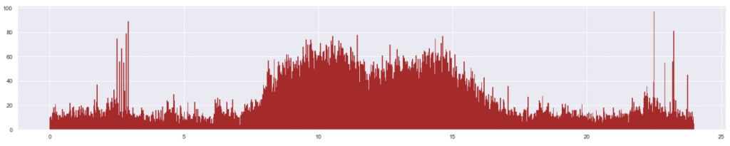
However, there are some spikes in the nighttime. Visually and intuitively, we think these are anomalies. Using the method described in the previous article, we can identify those abnormally high peaks:
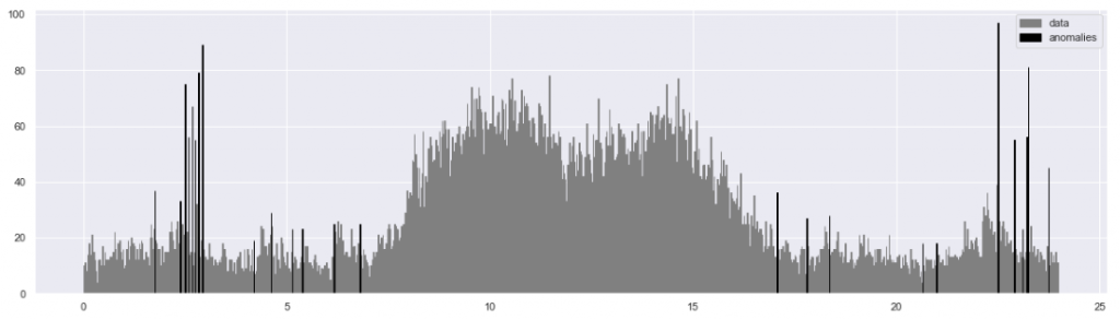
Job done, so off you go to some sexy stuff such as machine learning! Well, not quite. If a picture is worth 1,000 words, then not this one. In my view this visualization is not good enough. Try to count the anomalies… not easy. They visually merge. But also, the algorithm noticed more spikes than I expected. Some of them are surprisingly small. Is this a mistake? The picture does not tell. Hence, back to work. After some hours, here is an improved visualization:
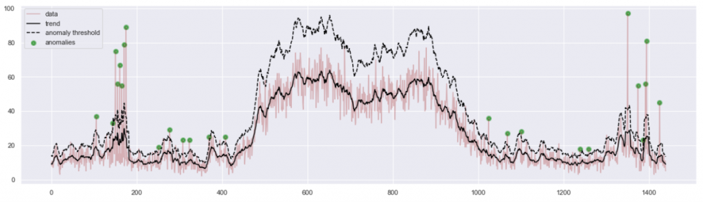
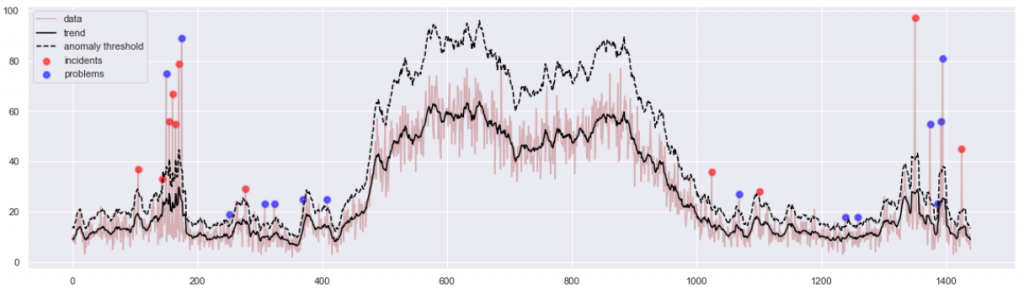
This one is much nicer. We were able to fit a number of pieces of information in one picture. The black line is the trend of the expected amount of incidents during various times of day. The dashed line shows how far from that trend a spike needs to be, to fit the statistical definition of an anomaly. This moving threshold explains why no daytime spikes have been identified as anomalies: a higher level of data noise caused the threshold to also move higher. Finally, the anomalous events have been marked as big green blobs, so they are conspicuous and easy to count.
This diagram is more informative. But when I brought it to the project team, I found it still unsatisfactory for practical reasons. The feedback was “… But what do we do with this information?” In fact, a spike in a frequency distribution of events aggregated from a longer period of time might mean one of two very distinct scenarios:
- ‘Incident’: an isolated burst of alerts that have been spawned once only. This means a bigger technical issue that happened on a certain day in the past. Maybe a server crashed, causing an avalanche of problems in the applications and systems that used that server.
- ‘Problem’: an issue which is not necessarily serious, but has been occurring regularly. Maybe some system has been throwing an alert on the same hour for many days.
Both problems and incidents are useful to analyze operationally, but the reason and nature of analysis is quite different. So, our spikes represent two logically distinct phenomena. I understood I should tell apart incidents from problems, before bringing them to the attention of the operational manager.
Surprisingly, this proved difficult. Let’s examine the leftmost green blob on Figure 4. The anomalous peak has 40 incidents, while the statistical anomaly threshold is at 30. Then up to 3/4 events of that peak are random noise. Only the remaining 10 events can help us understand whether we look at an incident or a problem. But which 10 events (out of 40) are they? It took me quite a while to work out a reliable method. It works. I may explain this in a subsequent article. The results:
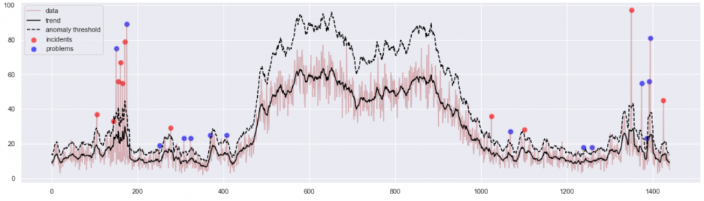
And the corresponding numeric statistics is:
peaks       	: 25 / 1440	= 1.7 % of all data points
data in peaks	: 1119/ 37835	= 3.0 % of all records
incidents / problems: 11 / 14
The visualization is now satisfactory and even quite elegant. It demonstrates why we think certain spikes are anomalous, and it also tells apart two types of anomalies. All this fits in one chart, and still does not overwhelm the reader. In addition, I have produced 11 CSV files of isolated incident data, and 14 CSV files of isolated problem data. One file per one spike. The project operational team thus received very concrete material, allowing them to focus their attention on 3% of the most problematic workload.
And yes, I do think this chart is worth 1000 words. It also holds a little secret: painting the blobs red and blue took more effort than the rest of the project. Now off we go, to explore some winter mountains.
P.S. Credits, as usual, to Sopra Steria, for whom the project was done. Great company to work for, should you ever consider!
Update on 3.4.2021:
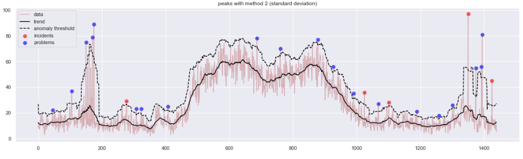
After I published the article, we had an internal follow-up exchange in Sopra Steria Data Science community that allowed us to progress with the method. On one hand, we’ve been experimenting with Exponentially-Weighted Moving Average (EMA) in place of simple moving average (SMA). On the other, the simplistic threshold for anomalies used above (n * MA, aka Boxcar Filter) can be replaced with an attempt to measure statistical significance of a peak in the relation to the moving window of its surrounding.
In particular, calculating a “Moving Variance” of that window allows to obtain both a “centrality” measure (SMA, or EMA) and a “dispersion” measure (variance, or the EMVar) which can lead to defining anomalies above n * stdev(). Special thanks to my colleague Alfredo Jesus Urrutia Giraldo for key remarks. Below is a sample illustration showing some advantages of that method, as compared to the previous method in Figure 5. Interestingly, both methods promote different types of input anomalies, so while our research has been progressing, I ended up using a combination of several such methods.