
Here is quite intriguing research with the data of our Sopra Steria IT operations (ITSM, AIOps, and Infrastructure Management).
I’ve been faced with an interesting situation in an IT Applications Management project for a large corporate client. In such a project, the workload is organized around the concept of incidents, alarms, and tickets. Due to their volume, they can be imagined as a constantly flowing river which ends up in our data lake where most of our processing gets done. This time, we needed to augment the real-time tracking of the event flow parameters with some subtle metrics, such as: what percentage of events of certain type pass to the next processing stage within 10 minutes? This specific indicator pertains to the certain arcane category of records. This part of the “data river” workflow includes many steps like validation, auto-resolution, and manual operation. The business owner is interested in measuring the period (the delta) of one of those steps, because it impacts the SLA (service level agreement).
The naïve answer
The answer does not require much Data Science skills. We’ve cleaned, filtered, and sorted the data, so we could calculate the percentiles processed in time. scipy.stats.percentileofscore() gave the required answer: 42%. This is the fraction of traffic we can process in 10 minutes. We also drew the CDF (cumulative distribution function) to have some feeling how this 42% number fits the big picture. Here it is.
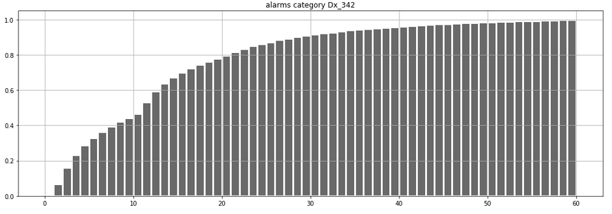
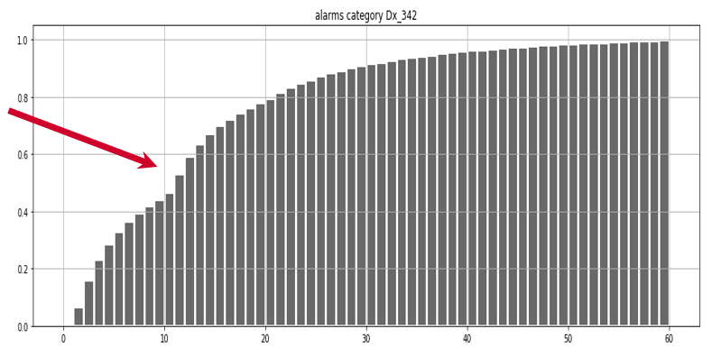
As you may see, the number 10 on x indeed corresponds to a point north of 40% on y. All right then, nothing spectacular. Question answered… end of the project?
Going the extra mile
We knew that the answer was important to business as this number was part of an intended contractual SLA. I wondered whether we could work out some suggestions on how to increase this parameter to over 50%. So we decided to go the extra mile, which ended up as quite an adventure. First we got interested in that dent seen just after 10 seconds.
Let’s see a non-cumulative histogram of the same, which often makes things more clear:
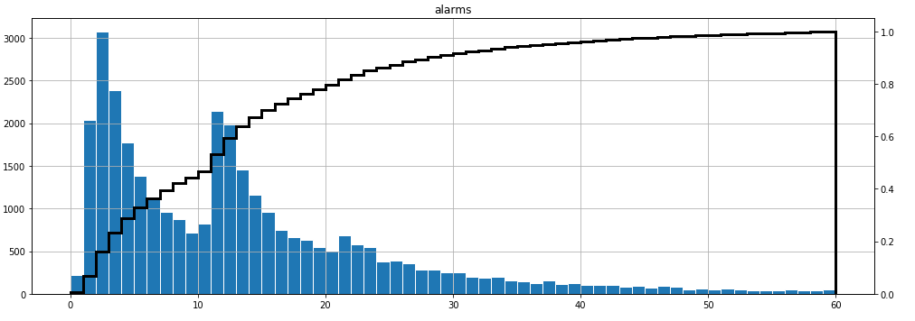
Well, that is interesting. The first aha moment of this research. This distribution is bimodal (trimodal, actually). We process a lot of events within 1-4 minutes, but there seems to exist a second population of events processed in 11-14 minutes. What would it take to process that second group just slightly faster? This is not something Data Science can help with, right? Wrong, because it actually can. We can try to understand why there are two (three?) “waves” – populations of events, surprisingly similar to one another. We can then pass this insight to the operational team. This may be a new inspiration to them, potentially leading them to a solution.
What was behind the bimodality
So why is it bimodal? Answers come faster when working with domain experts so I asked the operation floor pilots for ideas. The project team suggested that bimodality might have to do with the daytime. Times of day, week, and year may change characteristics of the flow of incidents. However, this hypothesis failed. Here is how the event density (KDE) looked against the times of the day. The bimodality persists regardless of the hour of the day…
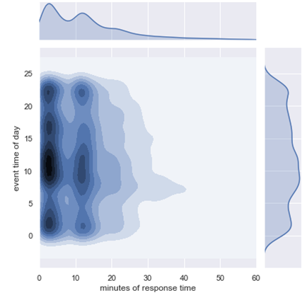
… but we discovered something else, right? That tail stretching towards right between 5 and 10 a.m. The KDE shows some things, but it hides some others so we had to redraw this several times. After some data fiddling and filtering, we established that actually there was not one, but two daily spikes (watch out, as below the time of day is on x-axis):

So in the end it looked like we had an issue around 7 a.m., followed by another at 7:00 p.m. It also looks that if we got rid of those issues, we could radically increase the percentage of traffic handled below 10 minutes. This was a nice insight to the project team. But let’s dig further because we still have not yet found the reason for bimodality.
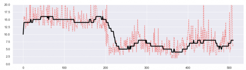
The next hypothesis was the calendar time. We drew various averages over the last 500 days of the project lifetime. Here is the monthly moving average (black) of the event processing delta we were interested in. It fluctuates, but without any obvious trend. So again, we ditched this hypothesis as an explanation for bimodality.
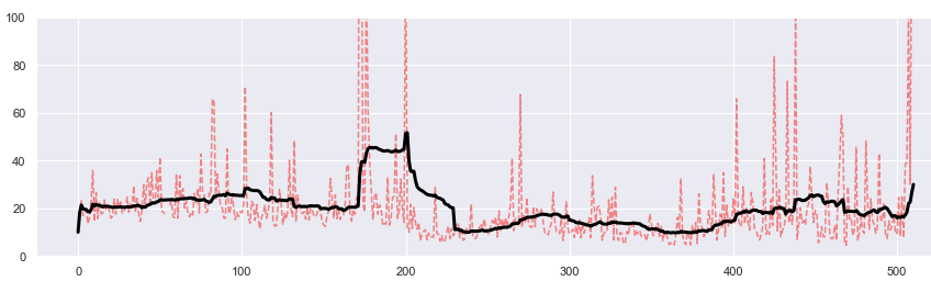
However, we got interested in those red spikes showing the daily averages. Apparently, there were certain days (not many of them) where the delta was dramatically different from average. We coined a working name: bad day deltas. This was another important insight because removing problems in just those few days would make a difference in the overall business value of the project. Yet again, this phenomenon is not the cause of bimodality either.
Since easy hypotheses failed, we decided to deploy statistical methods to understand what features may be correlated with those two bimodal spikes. We created some auxiliary variables representing the spiked areas and tried Spearman, Pearson, and Chi2 correlations against numeric and categorical features of the alarms respectively, in a few combinations. Due to several runs, it helped drawing the sorted ranks as heatmaps with python’s seaborn library. Numeric features should be ranked in separation from categorical ones, which multiplied the number of tests you need to do.
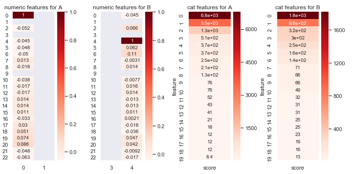
This was a strange moment. The results suggested that we should step back in our reasoning. Statistics said the bimodality was highly correlated with calendar time – the hypothesis we just rejected.
The second ‘eureka’
A closer look at the project period revealed something we haven’t seen initially. I earlier said that the KDE density plot hid certain things. But the same works the other way around: the moving average plot, which we’ve just seen above, will hide other things that density plots can show. So here is the same 500-day chart, now redrawn as a density plot. So we are seeing the density of events handled between 0 and 40 minutes (y-axis), and how this changed over the project timeline (x-axis)
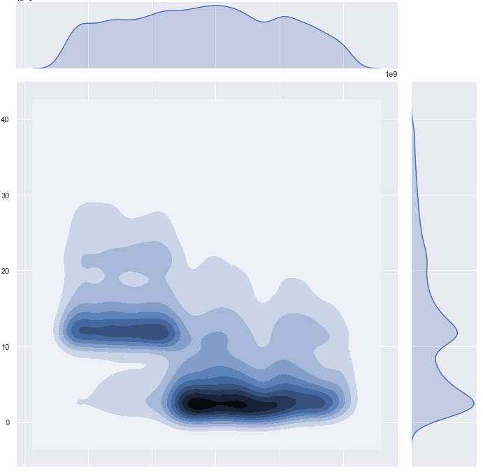
This was the second “aha” moment in the research. We finally separated the two populations of events, delineating them by a certain moment in time. On the right vertical axis, you see how those two populations nicely map to the bimodal shape we had been looking for. So in the end what was happening was quite simple: in the recent phase of the project, most events were handled in 1-4 seconds (represented by the first “dent” of the bimodal shape), while earlier in the project, most events were handled consistently longer, essentially delayed by 10 seconds, and that is represented by the second dent.
Now that we understood what was going on, we could easier define the subtle statistics that allowed us to pinpoint quite precisely the day and hour of that change (near number 200 on x below). We later referred to this moment as the epoch.
It is thought-provoking to observe that the moving average, shown earlier, did not show this clearly enough.
I will skip here the root cause analysis of this 10-minute delay, which is otherwise a quite interesting story, perhaps for another article. For now, I’ll just state that we identified the root cause as something caused by technical features of the monitoring architecture, which – importantly – can be controlled. The fundamental conclusion is that we actually don’t need to do anything to process these events faster, because the histogram was showing past, long-gone events.
Synthesis
Interestingly, in this exercise, we have pointed not one, but three features allowing to potentially shorten the response time of the alarms we were looking at. The project team, upon analysis, has confirmed our gut feeling that all three can be implemented be without much hassle: preventing the 7-hour spikes, the super-high bad-day deltas, and the 10-min delay before the epoch. Now here is the updated original histogram, split into tiers. Blue is what is left after removing the uppermost tiers, representing the aforementioned three bogus event groups, of which the pre-epoch population had the highest impact.
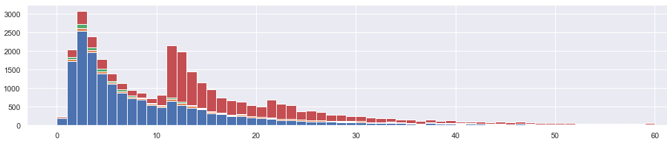
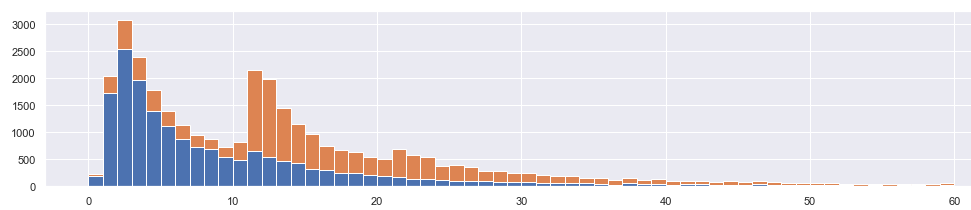
The percentage of traffic handled below 10 minutes is now 64%, up from originally calculated 42%. As such, the infrastructure is capable of handling much tighter SLA (service-level agreement) than originally perceived. Below it is drawn again, cleaner: we reduced the orange events, and the blue is what is left.
But how did we get here?
Interestingly, we have decided to go the extra mile beyond the project scope, due to intuition about a simple dent in the histogram. As the result, we have discovered not one, but three separate phenomena, effectively proving the original answer naively wrong.
It is an interesting situation that certainly improves the sixth sense of the researcher. If I see something similar again, I’d more easily picture in my mind the possible scenarios of problems and root causes. Also, this broadens our library of routine checks with new project due diligence.
But that won’t guarantee success. Here’s what’s most important: it helps if you like solving riddles.
Also see a followup to this article: how to split a distribution
Post scriptum, edits & comments
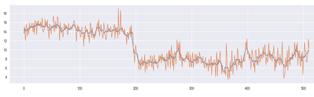
22.6.2020: as pointed by colleague, Sopra Steria’s Michel Poujol, the reasoning could have been more effective if moving median was deployed instead of moving average. Indeed, I made a quick test to confirm this. The earlier moving average chart has been redrawn below with moving median (red = daily, black = monthly). Indeed the shift at day 200 is more evident here. This is because of median is more robust against outliers, whose daily fluctuation may obstruct and disorient the average. Thanks Michel.
29.6.2020: I wrote a followup to this article, where this story is brought a few extra steps forward: How to Split a Distribution